The guidance (not legislation) is that lower case should always be used because all the evidence is that it’s easier to read for those who may have problems reading as the ascenders and descenders (I think these are the right terms) on the individual letters help some recognise the shape of words. I wish it was more rigorously enforced as at times we seem to have a hotch-potch of styles and fonts!Who decides if a station will be written as 'Cambridge South' or 'BRENT CROSS WEST' on the building exterior? I thought there were now recognised style guides on type faces, text sizes etc?
(I think upper and lower case is far neater FWIW).
-
Our booking engine at tickets.railforums.co.uk (powered by TrainSplit) helps support the running of the forum with every ticket purchase! Find out more and ask any questions/give us feedback in this thread!
You are using an out of date browser. It may not display this or other websites correctly.
You should upgrade or use an alternative browser.
You should upgrade or use an alternative browser.
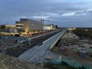
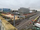
Cambridge South new station construction progress.
- Thread starter whittlesfordok
- Start date
Sponsor Post - registered members do not see these adverts; click here to register, or click here to log in
R
RailUK Forums
Nodding Cat Ch
Member
There was talk of a busway stop on the bridge feeding directly to the new station, but I think it's just that, talk.
Hopefully some thought it being put into route-finding around the Biomedical Campus. It is going to be quite a hike from the new station to most of the Addenbrookes departments, especially Outpatients. Plus there's the new Children's and Cancer hospitals being planned which will only add to the number of people wandering around the site.
Nicholas Lewis
Established Member
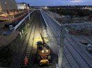
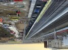
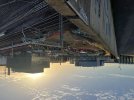
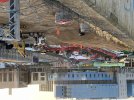
Good to see a project making rapid progress unlike some others.Couple of photos from earlier this afternoon showing progress during the possession this weekend. I hadn’t appreciated the conductors are actually made of copper (coated?) wire.
I hadn’t appreciated the conductors are actually made of copper (coated?) wire.
Solid copper (or alloy thereof)
vic-rijrode
Member
- Joined
- 31 Aug 2016
- Messages
- 288
If it ever opens, I want to be one of the first to use the kiss and ride site - sounds intriguing if rather too energetic for me these days.Perhaps of there was a kiss and ride site in Haverhill it might take quite a lot of traffic off the A1307 reducing congestion and pollution.
William3000
Member
Kiss & Ride is just a drop off and ride but without parking
If it ever opens, I want to be one of the first to use the kiss and ride site - sounds intriguing if rather too energetic for me these days.
Wasn't Kiss + ride a bit of a publicity gimmick somewhere that renamed their drop-off points for Valentines?Kiss & Ride is just a drop off and ride but without parking
Wasn't Kiss + ride a bit of a publicity gimmick somewhere that renamed their drop-off points for Valentines?
Not sure about that. The term has been in use for at least 30-40 years to my knowledge.
It was used by BART in San Francisco in the late 60s - my dad had a "Future of Rail" or similar titled book from around then which included a diagram of a station next to a freeway - I remember being horrified as a child that you had to kiss someone to get on the trainNot sure about that. The term has been in use for at least 30-40 years to my knowledge.
Nodding Cat Ch
Member
Will the existing tracks need to be moved to make way for the edge of platform 2 to be possible
My understanding is that is what is going to be happening in the Christmas/New Year block. On 2 January 2024 the trains should be running on the tracks through platforms 3 and 4.Will the existing tracks need to be moved to make way for the edge of platform 2 to be possible
Last edited:
swt_passenger
Veteran Member
- Joined
- 7 Apr 2010
- Messages
- 31,447
Definitely, the tracks currently in use are roughly where the future P2/3 island will be.Will the existing tracks need to be moved to make way for the edge of platform 2 to be possible
I think, (estimating from the first image in post #784), that the levelled base for the P2 wall will overlap the left hand ends of the current up line’s sleepers.
Last edited:
There is a Co-op open at Cambridge North, in the ground floor of the building opposite the station and hotel. It has quite wide ailses, a couple of Costa coffee machines, and 3 other machines for various drinks/milkshakes/ice creams. It open from 6am to 11pm Monday to Saturday, 7am-10pm on Sunday.If there is will it be occupied? Only the Costa at Cambridge North has being taken. The convenience store is still vacant though I think the wider area if coming along and that might go into a unit opposite the station and hotel.
The unit in the station itself is still empty.
There is a Co-op open at Cambridge North, in the ground floor of the building opposite the station and hotel. It has quite wide ailses, a couple of Costa coffee machines, and 3 other machines for various drinks/milkshakes/ice creams. It open from 6am to 11pm Monday to Saturday, 7am-10pm on Sunday.
Thanks - I'd entirely missed that this has opened, which doesn't say much for my observation skills :-/ I'll take a look tomorrow.
Edit : it is now tomorrow, I took a look when passing and saw it
") I was expecting it to be in the unit closest to the station - which is still empty - so that's my excuse for missing the obvious!
I was expecting it to be in the unit closest to the station - which is still empty - so that's my excuse for missing the obvious!
Last edited:
TheDavibob
Member
- Joined
- 10 Oct 2016
- Messages
- 407
Is there likely to be much in the way of weekend closures in the New Year? Nothing showing for Jan/Feb, which surprised me a bit but that might be me being overly pessimistic
Class 170101
Established Member
- Joined
- 1 Mar 2014
- Messages
- 7,942
Have a look here its probably further ahead than looking at Real Time Tains and the like but won't have exact timing detailsIs there likely to be much in the way of weekend closures in the New Year? Nothing showing for Jan/Feb, which surprised me a bit but that might be me being overly pessimistic
Service Alterations
Check when we'll have engineering works on our network Rail Replacement Buses Accessibility Our services are wheelchair accessible and use a dropped curb bus stop. We recognise these options may still present accessibility problems for some people. If this is the case for you, please contact our...
 www.greateranglia.co.uk
TheDavibob
Member
- Joined
- 10 Oct 2016
- Messages
- 407
Interesting, thanks - I'd been looking at Great Northern's equivalent which is not as complete (e.g. 3/4th Feb isn't on theirs).
Saturday 3 / Sunday 4 February and Saturday 2 / Sunday 3 March are both no trains between Royston and Cambridge.Interesting, thanks - I'd been looking at Great Northern's equivalent which is not as complete (e.g. 3/4th Feb isn't on theirs).
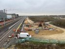
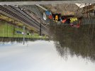
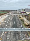
Here is a new view for the thread - north from the Long Road bridge. Showing some new OLE bases/mast which I assume are for the station work as well as a new foundation just to left of shot which may not be related.
Work continues on the station site but not much visual change so no photos.
Work continues on the station site but not much visual change so no photos.
Attachments
59CosG95
Established Member
The mast on the Up side looks like it'll be for a cross-track feed (XTF); in that case, the foundation to left of shot (on the Down side) is very much related!Here is a new view for the thread - north from the Long Road bridge. Showing some new OLE bases/mast which I assume are for the station work as well as a new foundation just to left of shot which may not be related.
Work continues on the station site but not much visual change so no photos.
Magdalen Road
Member
Interesting, thanks - I'd been looking at Great Northern's equivalent which is not as complete (e.g. 3/4th Feb isn't on theirs).

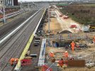
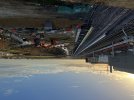
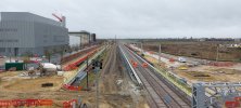
Here is the view of the station this morning. More concrete going in for the station building, some wires in the ducting under P4, and a big pile of earth has appeared where the forecourt will go.
Attachments
Nodding Cat Ch
Member


chris2
Member
Are the new lines temporary or final?
My understanding is a bit of both; the lines through the new platforms are final, but the lines that slew across are temporary and will be replaced by a final layout next December which allows access to all four platforms.Are the new lines temporary or final?