The fundamental purpose of all these maps is that they are of metros, not main line railways. I don't see how you could ever possibly show the main lines as well at major stations such as Waterloo, on the same m
Ah, that explains it. Thanks.
Thinking about it, though, the absence of these termini in Zone 1 kind of undermines the reliability of, and hence the usefulness of, these otherwise amazing and wonderful maps. I know they're just one guy's pet project, and he should be praised to the sky for creating them in the first place, but if I had a suggestion, it would be to at least sketch in, even if rudimentarily, ALL existing stations and tracks, even if just using tiny fonts and thin lines. In many places on the map the most obscure and trivial place-names are included, often in small font, which doesn't add too much busy-ness. I'd do the same for places like Waterloo East and the tracks to Charing Cross, etc.
For example, he includes the text "Old W&C track to Armstrong hoist" in the exact place where "Waterloo East" should be. What's more significant and deserving of map-space -- a short section of disused track a few yards long, or an entire major rail station? It'd be great if BOTH were included!
Looking back, the filename date for the first map, v1.0, is February 2011 (it may have been uploaded just before that). The map looks rather bare

. This showed the original tube lines only. Over the years, this was gradually expanded to include the main lines in the area of the map, most of which are effectively the suburban main lines.
Where possible (and when verified details were available), further information was added, such as disused tracks etc. These often gave a historical insight into an area, such as a station where there had been layout changes over the years. One example of this are the stations on the Barnet Branch between East Finchley and High Barnet which were originally mainline stations, complete with goods / coal yards and additional sidings and track work.
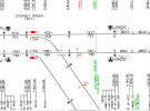
As time went on, track labelling was was also added in some places where it may be useful in identifying the tracks, such as at some junctions etc. This is usually in small print directly on the line. An example of this is at the tangle of lines in the Queenstown Rd / Stewarts Lane depot area east of Clapham Junction.
There is a lot of detail on the map, and it’s always best to zoom right in if specifically looking at an area.
There is also the London Lines map (CartoMetro site) , which shows the general track naming for the whole of the map area.
Regarding the Armstrong lift, that is part of the W&City line which is shown in full, but I get the point you’re making.
I don’t know how others use the map, but I use it daily, especially as a reference, often when following comments in a forum, or whatever, made about a specific area etc.
 cartometro.com