Helvellyn
Established Member
- Joined
- 28 Aug 2009
- Messages
- 2,254
And the rebranded website is here (although the press release shows that) >>> https://www.freightliner.co.uk/
I would think so. Rotterdam Rail Feeding is another Genesee & Wyoming operation, and this is how their EMD JT42CWRs look.
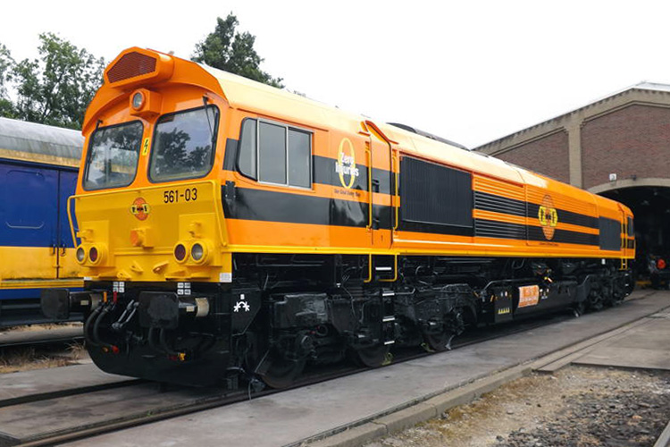
I wouldn't be surprised if that is how the Freightliner 66s look as well
On the contrary, I would be very happy to see a black and orange* painted loco passing every few minutes on all our main lines hauling 90+ TEUs at 75mph!The Black & Orange is corporate G&W colours.
They have been operating in Australia for some decades and can be seen in most states. I believe that the local Freightliner locomotives have all bee repainted G&W. More recently they purchased the business of Glencore and are busily repainting those locomotives. They are also busy rebranding the many hundreds of coal waggons which came with the purchase.
The colour scheme looks good in green countryside. It is hoped that it does not become as ubiquitous as some fast food outlets.
What a ghastly logo - typical American job. It looks like it was designed at primary school using MS Paint.
I would think so. Rotterdam Rail Feeding is another Genesee & Wyoming operation, and this is how their EMD JT42CWRs look.
I wouldn't be surprised if that is how the Freightliner 66s look as well
Irish rail 1990s anyone?this is how their EMD JT42CWRs look.

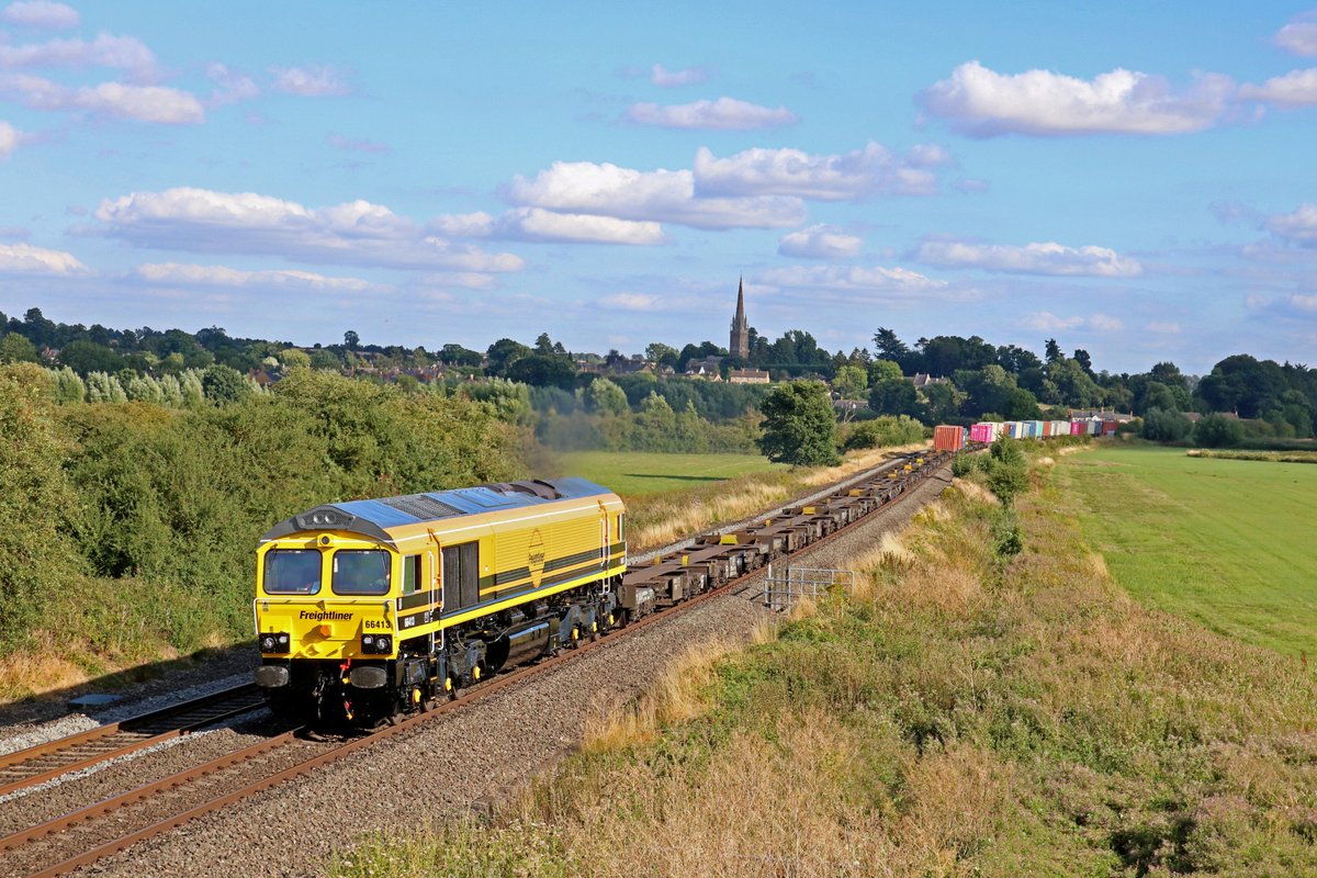
The latest update to the WNXX news page states that 66413 has entered LNWR at Crewe for its booked repaint. I wouldn't be surprised to see it emerge wearing a livery similar to the one you linked.
413 is one of the ex-DRS 66s that was still running around in de-branded DRS livery with freightliner logos:
Irish rail 1990s anyone?
Not necessarily. Effectively only the Dutch speak Dutch so English could well be better.I just noticed on the Dutch '66-a-like' that they have a '0 zero injuries' label. Now, I have full respect for people in other nations learning our language, but is there any reason why this couldn't be translated into Dutch ('nul gewonden', according to Google translate)? The message must carry more weight in the mother tongue, surely?
I found that shops, supermarkets, and restaurants in the Netherlands quite often have signs solely in English now. Schipol Airport's newest signs are the same.I just noticed on the Dutch '66-a-like' that they have a '0 zero injuries' label. Now, I have full respect for people in other nations learning our language, but is there any reason why this couldn't be translated into Dutch ('nul gewonden', according to Google translate)? The message must carry more weight in the mother tongue, surely?
413 will be the first in the new livery.
https://twitter.com/FlywheelMedia1/status/1022942455220654080?s=19Goodbye green. Hello orange. From @wnxxuk courtesy of well known photographer F Rother. 66413 in its new Genessee & Wyoming colours at LNWR, Crewe. @RailwayMagazine

Interesting that the black stripes are thinner and lower than the Dutch loco shown earlier.An image has been posted to Twitter showing the loco in its new colours:
https://twitter.com/FlywheelMedia1/status/1022942455220654080?s=19
https://www.facebook.com/newjunctionrailway/posts/1767518116694683
That is one seriously poor logo. I really hope they didn't pay too much for it, maybe a bag of sweets? I don't understand why they would want to go with the same colours as an existing operator? The concept of harmonising your identity is all very well, but, if in the process you lose it, then it ceases to have much by way of benefits!Orange is the new Green! It looks like they're being brought in line with their parent company, Genesee & Wyoming. Will be interesting to see how long it takes them to rebrand

https://www.freightliner.co.uk/
That is one seriously poor logo. I really hope they didn't pay too much for it, maybe a bag of sweets? I don't understand why they would want to go with the same colours as an existing operator? The concept of harmonising your identity is all very well, but, if in the process you lose it, then it ceases to have much by way of benefits!
I beg to differ! From a design esthetic, the way the text is sized in relation to the lozenge is cringeworthy. It's plain to see that they have "shoehorned" in the Freightliner text into a pre-existing graphic device and that it doesn't fit. If you look at the Pentalever device, then the text is contained nicely in the lozenge, unlike the rail counterpart. The font and design is more suited to a small packaging "box flash" on some cereal. Why they haven't included any radius text in the roundel is also most odd as the other sector does. Yes, it creates diferentiation from the other sector, but then why incude text in theirs? It makes it look unfinished.It's a perfectly fine logo. The parent company is a multi-national with a very long standing colour palette and won't give two hoots that smaller operators are using broadly similar colours, that's just their branding.
That is one seriously poor logo. I really hope they didn't pay too much for it, maybe a bag of sweets? I don't understand why they would want to go with the same colours as an existing operator? The concept of harmonising your identity is all very well, but, if in the process you lose it, then it ceases to have much by way of benefits!
Could you try designing a logo?Speaking as a graphic design branding specialist, I always advocate with my clients that consistency of image and colours is vital to maintain the strength of a brand.
That is one seriously poor logo. I really hope they didn't pay too much for it, maybe a bag of sweets? I don't understand why they would want to go with the same colours as an existing operator? The concept of harmonising your identity is all very well, but, if in the process you lose it, then it ceases to have much by way of benefits!

It's Schiphol. That mistake is made so often, I notice. The trend you identify correctly is a matter of Dutch national shame, IMO.I found that shops, supermarkets, and restaurants in the Netherlands quite often have signs solely in English now. Schipol Airport's newest signs are the same.