• Our booking engine at tickets.railforums.co.uk (powered by TrainSplit) helps support the running of the forum with every ticket purchase! Find out more and ask any questions/give us feedback in this thread!

Stations rebranded to Great British Railways design / Rail Alphabet 2

Bletchleyite

Veteran Member
Joined
20 Oct 2014
Messages
97,896
Location
"Marston Vale mafia"
I would be amazed if ScotRail or TfW adopted any part of the GBR branding whatsoever (other than the double arrow as used now). Sturgeon and Drakeford will just tell HMG to get stuffed.

The rest of it, yes, latter day BR had a standard, which was PTE/other sponsor logo on the left of the sign, which worked well enough.
 
Last edited:
Sponsor Post - registered members do not see these adverts; click here to register, or click here to log in
R

RailUK Forums

Goldfish62

Established Member
Joined
14 Feb 2010
Messages
10,061
I would be amazed if ScotRail or TfW adopted any part of the GBR branding whatsoever (other than the double arrow as used now). Sturgeon and Drakeford will just tell HMG to get stuffed.

The rest of it, yes, latter day BR had a standard, which was PTE/other sponsor logo on the left of the sign, which worked well enough.
Latter day BR had a multitude of different styles of signage. Quite apart from the PTE stuff there was NSE, Regional Railways and Intercity.
 

Bletchleyite

Veteran Member
Joined
20 Oct 2014
Messages
97,896
Location
"Marston Vale mafia"
Latter day BR had a multitude of different styles of signage. Quite apart from the PTE stuff there was NSE, Regional Railways and Intercity.

The PTE signage was mostly modified Regional Railways (i.e. the standard blue stripe and "device" with the PTE logo on the left of the white part), with a few exceptions (I *think* Metro and Merseyrail). There are and were no PTEs in the NSE area, and InterCity stations were never shown in that way even if PTE services served them.
 

Goldfish62

Established Member
Joined
14 Feb 2010
Messages
10,061
The PTE signage was mostly modified Regional Railways (i.e. the standard blue stripe and "device" with the PTE logo on the left of the white part), with a few exceptions (I *think* Metro and Merseyrail). There are and were no PTEs in the NSE area, and InterCity stations were never shown in that way even if PTE services served them.
I was referring to the variety of different styles of BR signage latterly, not specifically PTE. NSE, Regional Railways and InterCity all had their own styles.
 

sjasct

New Member
Joined
27 Aug 2021
Messages
3
Location
Leeds
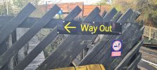
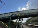
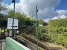
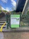
Outwood (West Yorks) seems to have gained a RA2 Way Out sign at the P1 exit relatively recently, but this was the only trace of any new signage that I could find. The platform side station name signs were still Northern/WY Metro branded.

Makes me wonder why they've just done this sign, but not any of the other signs. Best guess is the old way out sign (that I can't 100% remember existing) needed replacing, and they just happened to take from the RA2 pile?

20220420_073241(1).jpg
 

plymothian

Member
Joined
26 Sep 2010
Messages
738
Location
Plymouth
GWR Cornwall vs Devon.
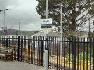
Currently Cornwall is being resigned to RA2 but leaving some of the station name boards in GWR Glypha brand (waiting for TfC branding?); Devon's resigning appears to also be replacing the name boards with RA2 at the same time (see also Dawlish). Redruth (up thread) has gone the Devon 'whole hog' way.
 

Attachments

  • 20220316_120227.jpg
    20220316_120227.jpg
    3.6 MB · Views: 294
  • 20220417_204245.jpg
    20220417_204245.jpg
    3.8 MB · Views: 293
Last edited:

Goldfish62

Established Member
Joined
14 Feb 2010
Messages
10,061
GWR Cornwall vs Devon.
Currently Cornwall is being resigned to RA2 but leaving some of the station name boards in GWR Glypha brand (waiting for TfC branding?); Devon's resigning appears to also be replacing the name boards with RA2 at the same time (see also Dawlish). Redruth (up thread) has gone the Devon 'whole hog' way.
While my preference is still for white reversed out of a dark coloured background these look fine. Seems as though deleting the 1970s red double arrow and replacing with a TOC branding strip brightens up the whole thing. Who have thought? ;)
 

plymothian

Member
Joined
26 Sep 2010
Messages
738
Location
Plymouth
Noticing only now that Hayle, whilst being in RA2 has no TfC branding unlike Redruth, so maybe the Glypha ones that have been left standing just haven't been manufactured yet.
 

Goldfish62

Established Member
Joined
14 Feb 2010
Messages
10,061
Noticing only now that Hayle, whilst being in RA2 has no TfC branding unlike Redruth, so maybe the Glypha ones that have been left standing just haven't been manufactured yet.
Or, hopefully, they don't need replacing so money isn't being wasted doing so.

Re TfC it may be an oversight or maybe because while Redruth Station is an interchange with bus services, Hayle Station isn't really.
 

185

Established Member
Joined
29 Aug 2010
Messages
5,000
Personal opinion, but it didn't take long for this signage clearance project to return to some TOCs making the exact errors that brought it about....

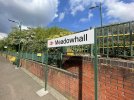
Station signs should say the station name, clearly, nothing else. Not Sponsored by GWR, TPE, FGZ, not emblems for some line that was there in the 1860s, not (like Hale, Cheshire) adverts for Coopers Creosote, the Creosote you can rely on! ...just the station name on the sign - clear as that.
 

43096

On Moderation
Joined
23 Nov 2015
Messages
15,307
Station signs should say the station name, clearly, nothing else. Not Sponsored by GWR, TPE, FGZ, not emblems for some line that was there in the 1860s, not (like Hale, Cheshire) adverts for Coopers Creosote, the Creosote you can rely on! ...just the station name on the sign - clear as that.
Exactly this. When passengers want to know where they are, the requirement is for an easily readable sign. They don't care who the station operator is (they may be on a different company's train), or that it is sponsored by some estate agent no-one's ever heard of. It's really not difficult to get this right.
 

nlogax

Established Member
Joined
29 May 2011
Messages
5,374
Location
Mostly Glasgow-ish. Mostly.
Personal opinion, but it didn't take long for this signage clearance project to return to some TOCs making the exact errors that brought it about....

Station signs should say the station name, clearly, nothing else. Not Sponsored by GWR, TPE, FGZ, not emblems for some line that was there in the 1860s, not (like Hale, Cheshire) adverts for Coopers Creosote, the Creosote you can rely on! ...just the station name on the sign - clear as that.

I would hope those GWR customisations can be easily removed. Ironic that the best quality implementations of RA2 can be found at their stations though.
 

TT-ONR-NRN

Established Member
Joined
30 Dec 2016
Messages
10,481
Location
Farnham
Personal opinion, but it didn't take long for this signage clearance project to return to some TOCs making the exact errors that brought it about....

Station signs should say the station name, clearly, nothing else. Not Sponsored by GWR, TPE, FGZ, not emblems for some line that was there in the 1860s, not (like Hale, Cheshire) adverts for Coopers Creosote, the Creosote you can rely on! ...just the station name on the sign - clear as that.
Or like Salisbury, which used to randomly advertise St James something on every sign.
 

185

Established Member
Joined
29 Aug 2010
Messages
5,000
I don't have a problem with adverts underneath station signs, earns the railway a few extra coins.
The adverts belong on a different sign. Shoving it on the same sign often reduces font size to 50% and makes the station name look like an afterthought.

London Euston
Sponsored by Dambusters Laxatives!
 

Towers

Established Member
Joined
30 Aug 2021
Messages
1,681
Location
UK
Completely agree about ads not belonging on station signage. What I find particularly frustrating are those locations where entire signs, obviously originally installed to carry the station name, have been deemed surplus and turned into solely an advertising space, which is one of the least customer friendly things you could do with them!
 

birchesgreen

Established Member
Joined
16 Jun 2020
Messages
5,159
Location
Birmingham
You have to be careful as they can be seriously misleading.

"Stafford, home of Wolverhampton University" :D

I worked at BCU's marketing department when they got the "coup" of putting BCU ads at Wolverhampton station, the senior management were so excited you'd think they'd have invented cold fusion.

WLV got their "own back" by putting an ad on a billboard outside our main campus.

All very easily pleased.
 

Trainfan2019

Member
Joined
9 Aug 2019
Messages
452
The adverts belong on a different sign. Shoving it on the same sign often reduces font size to 50% and makes the station name look like an afterthought.

London Euston
Sponsored by Dambusters Laxatives!
Well said about advertising. Station name signs should be for the name of the station only, just like they used to be for however many decades.
 

JaJaWa

Established Member
Joined
14 Feb 2013
Messages
1,705
Location
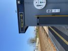
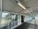
That is the standard for exit signs isn't it?
Yep no complaints about this one (technically it differs from the Northern version because of the white border but this one stands out a lot more).
 

JaJaWa

Established Member
Joined
14 Feb 2013
Messages
1,705
Location

Attachments

  • FRMcKLsWUAA7yan.jpeg
    FRMcKLsWUAA7yan.jpeg
    736.5 KB · Views: 245
  • FRMcKLtXoAIvlV2.jpeg
    FRMcKLtXoAIvlV2.jpeg
    512.8 KB · Views: 244
  • FRMcKLtWYAE9-cK.jpeg
    FRMcKLtWYAE9-cK.jpeg
    611.8 KB · Views: 236
  • FRMcKLwXEAAskX0.jpeg
    FRMcKLwXEAAskX0.jpeg
    528.1 KB · Views: 237
  • FRMcLo6X0AE4DIe.jpeg
    FRMcLo6X0AE4DIe.jpeg
    637.2 KB · Views: 239
  • FRMcLp1XoAAgZ2x.jpeg
    FRMcLp1XoAAgZ2x.jpeg
    537.8 KB · Views: 235
  • FRMcLqsXsAA1Q-p.jpeg
    FRMcLqsXsAA1Q-p.jpeg
    394.1 KB · Views: 226
  • FRMcLrjWUAAm0XN.jpeg
    FRMcLrjWUAAm0XN.jpeg
    404.1 KB · Views: 225
  • FRMcMdYXsAASCKD.jpeg
    FRMcMdYXsAASCKD.jpeg
    792 KB · Views: 224
  • FRMcNMBXIAIpXqr.jpeg
    FRMcNMBXIAIpXqr.jpeg
    611.8 KB · Views: 244
Last edited:

HarryL

Member
Joined
14 Sep 2020
Messages
241
Location
Leeds
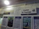
The fears people had about the white backgrounds not standing out has hopefully been dispelled. In those photos they stand out perfectly, even within the mostly white corridor. The slightly oversized nature of the background with the use of blank space draws the eye nicely.
 

318259

Member
Joined
11 Jun 2011
Messages
176
ScotRail almost certainly won’t be adopting the new GWR style.

They went through a massive rebranding, re-signing and repainting exercise back in 2010, when they launched the ScotRail brand and stopped letting the franchise holder make these decisions.

ScotRail sign branding
 

Parallel

Established Member
Joined
9 Dec 2013
Messages
3,937
it’s really growing on me i can’t lie
The Settle and Carlisle line stations certainly looked good with the new plain branding when I used the route a few weeks ago! The Northern branding would’ve got lost in the surroundings.
 

Top