• Our booking engine at tickets.railforums.co.uk (powered by TrainSplit) helps support the running of the forum with every ticket purchase! Find out more and ask any questions/give us feedback in this thread!

Stations rebranded to Great British Railways design / Rail Alphabet 2

Devonian

Member
Joined
10 Sep 2019
Messages
197
Location
Totnes
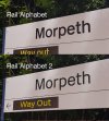
Still missing a double arrow on the station name board but it is in RA2
I'm certain that all those signs are in a version of traditional Rail Alphabet, not RA2.

They are using the new symbols, and using the new arrows, but in the old one-per-line way.

I really feel sorry for whoever drew up the new guidelines that seem to be doomed to be ignored.
 
Sponsor Post - registered members do not see these adverts; click here to register, or click here to log in
R

RailUK Forums

Mrwerdna1

Member
Joined
18 Jul 2018
Messages
61
Location
The Continent
I'm certain that all those signs are in a version of traditional Rail Alphabet, not RA2.

They are using the new symbols, and using the new arrows, but in the old one-per-line way.

I really feel sorry for whoever drew up the new guidelines that seem to be doomed to be ignored.
Well, I think what the shoddy implementation so far has shown is that until GBR comes into force or Britain's (or rather England's) railways are entirely renationalised, standardised signposting and the likes will simply not happen. For some select things, taking a one-size fits all approach really is necessary. Nobody disputes this when it comes to road signage, so why is it so difficult for TOCs and local NR divisions to grasp that concept?
 

Goldfish62

Established Member
Joined
14 Feb 2010
Messages
10,089
Well, I think what the shoddy implementation so far has shown is that until GBR comes into force or Britain's (or rather England's) railways are entirely renationalised, standardised signposting and the likes will simply not happen. For some select things, taking a one-size fits all approach really is necessary. Nobody disputes this when it comes to road signage, so why is it so difficult for TOCs and local NR divisions to grasp that concept?
I don't understand the timing of it. The railways are in such a state of flux and GBR seems to be ever receding into the distance so now seems a very strange time to be implementing a piecemeal programme of signage standardisation.
 

HarryL

Member
Joined
14 Sep 2020
Messages
243
Location
Leeds
I don't understand the timing of it. The railways are in such a state of flux and GBR seems to be ever receding into the distance so now seems a very strange time to be implementing a piecemeal programme of signage standardisation.
It's never been a GBR thing in the first place. Network Rail initiated the signage program in 2018 so it was presumably expected they would have either taken over the running of stations, or that they would have forced the TOCs to use it somehow. As far as GBR is concerned, they have never had any part in this program, the timing has just conveniently meant that they can inherit it without having to make their own standards.

None of it explains why the current operators are being allowed to just ignore any standards and apply them however they wish though. It could be that there's possibly a lack of will to rock the boat and force things when there's a big looming change on the horizon anyway.
 

JaJaWa

Established Member
Joined
14 Feb 2013
Messages
1,705
Location
It's never been a GBR thing in the first place. Network Rail initiated the signage program in 2018 so it was presumably expected they would have either taken over the running of stations, or that they would have forced the TOCs to use it somehow. As far as GBR is concerned, they have never had any part in this program, the timing has just conveniently meant that they can inherit it without having to make their own standards.

None of it explains why the current operators are being allowed to just ignore any standards and apply them however they wish though. It could be that there's possibly a lack of will to rock the boat and force things when there's a big looming change on the horizon anyway.
Rail Alphabet 2 + the “return” of the BR double arrows + black-on-white signs + GBR are all being spearheaded by the same people so they are very much interlinked.

I would hope for slightly more consistency however if they don’t want have to replace all these signs again.
 

omnicity4659

Member
Joined
25 Sep 2017
Messages
152
That’s Rail Alphabet 2 on all those signs - but they’ve missed one of the main design points which is grouping destinations.

(This allows you to understand the sign much quicker, if it didn’t then road signs wouldn’t be designed the same way).

Still missing a double arrow on the station name board but it is in RA2

The Ks and Ts on the signage are different to Rail Alphabet 2. May not be Helvetica but it certainly isn't RA2.
 

HarryL

Member
Joined
14 Sep 2020
Messages
243
Location
Leeds
Rail Alphabet 2 + the “return” of the BR double arrows + black-on-white signs + GBR are all being spearheaded by the same people so they are very much interlinked.
I'm not sure it's true that they're interlinked in this way.

Rail Alphabet 2 appears to follow a similar vein to when TfL had their Johnston typeface modernised and remade into Johnston 100, I don't think it's a coincidence that Peter Hendy has been the chair of these organisation when both of these things happened. He was very involved in the Johnston 100 project so it makes sense he would have also wanted to see the return of a modern Rail Alphabet to replace Network Rails ageing signs.

GBR appears to have sprung out of various factors, namely the Williams review initiated the general idea, then the review was kept pretty quiet for a bit and then it was then kicked into gear at the start of Covid when the privatised system collapsed in on itself.

I don't believe that the signage and GBR both happened linked together, I think it was just a case that they happened to take place at the same time separately and ended up stuck together when various outside forces changed things.
 

Leyland Bus

Member
Joined
20 May 2021
Messages
368
Location
York
That’s Rail Alphabet 2 on all those signs - but they’ve missed one of the main design points which is grouping destinations.

(This allows you to understand the sign much quicker, if it didn’t then road signs wouldn’t be designed the same way).
It's neither, it's original Rail Alphabet. Very obviously so infact, the lower case "a" is a massive give away for a start... A couple of new signs have popped up at York recently, also in original Rail Alphabet, superseding ones in Helvetica...
 

omnicity4659

Member
Joined
25 Sep 2017
Messages
152
It's ironic how we've gone decades straying away from Rail Alphabet in favour of TOC's own typefaces...to somehow returning to it when attempts are being made to succeed both!

Does Morpeth qualify as the first station to lose its RA2 signage? It was only last autumn when they fitted it to the station boards... these new RA1 signs have appeared within the past month.
 

gabrielhj07

Member
Joined
5 May 2022
Messages
1,011
Location
Haywards Heath
Not sure if it’s been said already but the entrance you the underpass at York P5 looks like RA2, although I have to admit it’s pretty hard to differentiate.
 

jon0844

Veteran Member
Joined
1 Feb 2009
Messages
28,070
Location
UK
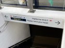
Why the BR logo instead of the internationally recognised symbol/icon for platform?

The (G)BR logo can be used on station sign names and the exterior of the station etc.

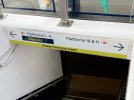
The style guide also seems off, or not adhered to, regarding the justification and indents. Plus (as mentioned) the 'Please mind your head' is not related to directions and should have been written below.

Given how expensive these signs are to produce, it's worrying that so many seem badly made and will be with us for many, many years.
 

jon0844

Veteran Member
Joined
1 Feb 2009
Messages
28,070
Location
UK
The York one looks like it cost a fiver to make.

They all do (but the irony will be that they cost significantly more than a fiver each - try £300-600 pounds per sign, excluding installation). The extra thin arrows seem totally wrong.

Then again, my local council opted to produce signs that have NO arrows at all. The direction is simply the direction the bit of metal is pointing from the pole. At first glance it just looks like a pole with a list of items.
 

43172

Member
Joined
7 Oct 2020
Messages
152
Location
South west England
Good(?) attempt at York.
Could maybe just do with a line down the middle.

View attachment 116030
It could do with moving the "Please mind your head" notice being moved down a line below the way out notice, then being placed in the centre as to not give the impression that some parts of the underpass are lower than others.

You could get away without a line down the middle if the notice for platforms 10 and 11 was a) moved half a line down (assuming the previous notice in the paragraph above was moved) or b) have it written as "platforms" on one line and "10 & 11" driectly below it.
 

jon0844

Veteran Member
Joined
1 Feb 2009
Messages
28,070
Location
UK
This is why there should be a style guide (which there clearly is) and that it is followed, properly. Otherwise, all these new signs are going to be a mess.
 

JaJaWa

Established Member
Joined
14 Feb 2013
Messages
1,705
Location
This is why there should be a style guide (which there clearly is) and that it is followed, properly. Otherwise, all these new signs are going to be a mess.
It’s linked in the first post in this thread
 

Devonian

Member
Joined
10 Sep 2019
Messages
197
Location
Totnes
Why the BR logo instead of the internationally recognised symbol/icon for platform?
I seem to recall reading an explanation for this that was something like "none of the pictograms are clearly a train rather than a tram, whereas the double arrow always means trains".
It could do with moving the "Please mind your head" notice being moved down a line below the way out notice, then being placed in the centre as to not give the impression that some parts of the underpass are lower than others.
Having "Please mind your head" as black text on a yellow strip along the bottom of the sign would match the usual standards for warning signs and separate it from the directions.
mind-your-head.jpg
 

thomalex

Member
Joined
25 Aug 2021
Messages
343
Location
Leeds
I seem to recall reading an explanation for this that was something like "none of the pictograms are clearly a train rather than a tram, whereas the double arrow always means trains".

Having "Please mind your head" as black text on a yellow strip along the bottom of the sign would match the usual standards for warning signs and separate it from the directions.
View attachment 116045

This is brilliant. I thought it was the real sign and was thinking they've done a great job here.... and then I saw what had actually been installed. Turn right to mind your head
 

gabrielhj07

Member
Joined
5 May 2022
Messages
1,011
Location
Haywards Heath
Coventry has some (new) signs up, someone must have heeded the advice from this forum about making the way out sign more visible!

Worth noting that this is a minority of signs at the station, many old footbridge signs are still in place.
 

Attachments

  • DD568333-1FD9-454B-AF4F-F8DBC841F10A.jpeg
    DD568333-1FD9-454B-AF4F-F8DBC841F10A.jpeg
    2 MB · Views: 239
  • 6C845A67-C0DD-46F1-8D9C-5B381F1D74A5.jpeg
    6C845A67-C0DD-46F1-8D9C-5B381F1D74A5.jpeg
    3.4 MB · Views: 244

gabrielhj07

Member
Joined
5 May 2022
Messages
1,011
Location
Haywards Heath
Someone has done an exceptionally poor job of lining the arrow up with the text there!
I reckon they sneezed in MS Paint.

Another thing I’ve just seen, the signage at the top of the tube escalators that directs you towards the main station is being redone in RA2.
 
Last edited:

Top