It seems fine to me. It's aligned with the Platforms textSomeone has done an exceptionally poor job of lining the arrow up with the text there!
-
Our booking engine at tickets.railforums.co.uk (powered by TrainSplit) helps support the running of the forum with every ticket purchase! Find out more and ask any questions/give us feedback in this thread!
You are using an out of date browser. It may not display this or other websites correctly.
You should upgrade or use an alternative browser.
You should upgrade or use an alternative browser.
Stations rebranded to Great British Railways design / Rail Alphabet 2
- Thread starter JaJaWa
- Start date
Sponsor Post - registered members do not see these adverts; click here to register, or click here to log in
R
RailUK Forums
The arrow is meant to be as big as the entire list of items.It seems fine to me. It's aligned with the Platforms text
Code:
/|\  Platforms 1 & 4
| Way OutGreater Anglia won't be happy... just call it British Rail. I doubt people will be calling it great when there's downed wires somewhere one hot summer..."AngloRail - Hyns Horn Sowsnek - England's Railway" anyone??
Will GBR start buying franchises abroad, the same way other state railways run most of our services at present?
Rather nice one from York. Think they should have used the meeting point symbol though?

Source: https://twitter.com/GarethDennis/status/1544755424712425472
Source: https://twitter.com/GarethDennis/status/1544755424712425472
py_megapixel
Established Member
Rather nice one from York. Think they should have used the meeting point symbol though?
View attachment 117249
Source: https://twitter.com/GarethDennis/status/1544755424712425472
Surely it should be the "mobility assistance" symbol, which looks like this:

(image shows a pictogram of a mobility scooter, taken from the Network Rail "Wayfinding Design Guidance")
Mrwerdna1
Member
Maybe it's because I've been living on the continent for too long, but what I care about most of all is not what the individual designs look like (frankly, one could argue that this RA2 sign is alright, where others are perhaps a bit bland or ugly, or even both). What matters most to me is *consistency*. In my view, there should be one entirely universal, standardised design. Could it be flawed? Sure. Those flaws can then be improved in the next roll-out. But what bugs me more than anything else is inconsistency. It's just so sad to see how even these new supposedly standardised RA2 signs differ greatly depending on the location. It is simply not good enough.


They should have used the Mobility Assistance symbol and somehow they've also got the wrong Information symbol. Apart from that this is one of the best I've seen yet.
EDIT: So it's the Tourist Information symbol they've used which it may well be, if so however it should be labelled properly

Last edited:
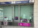
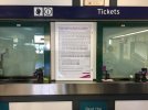
Couple more new ones from York (apparently the whole station is being redone)


Source: https://twitter.com/GarethDennis/status/1546533521124106242
Source: https://twitter.com/GarethDennis/status/1546533521124106242
They... actually look pretty decent.Couple more new ones from York (apparently the whole station is being redone)
Yes, I really like them. First one is missing the dividers between the sections though.They... actually look pretty decent.
Bletchleyite
Veteran Member
They... actually look pretty decent.
I think they look cluttered, awkward and Spartan, and the font is itself ugly and awkward. Still not a fan at all.
dodecahedron67
Member
Having been in York station quite a bit recently, these look very good in person. Clear, readable from both a distance and up close. They’ll need to keep on top of cleaning though
jhy44
Member
Love it! Shows just how much difference it makes when they're done correctly and using high-quality materials.Couple more new ones from York (apparently the whole station is being redone)
View attachment 117530View attachment 117531
Source: https://twitter.com/GarethDennis/status/1546533521124106242
I had the 'pleasure' of seeing the ones at Truro this weekend, they look cheaply done and poor; these York examples put them to shame.
I wish they'd always number the exits though; its far easier and clearer to say 'use Exit 2' rather than 'use the Exit for Holgate Road', especially for people whose first language may not be English.
Peter Sarf
Established Member
Puzzles me - if done by numbers then you have to have some indication of what the exit numbers mean. Anyone who is that familiar will not need to read the signs to find an exit anyway. North Exit and South Exit (for or whatever) might be more meaningful for those with a sense of direction.Love it! Shows just how much difference it makes when they're done correctly and using high-quality materials.
I had the 'pleasure' of seeing the ones at Truro this weekend, they look cheaply done and poor; these York examples put them to shame.
I wish they'd always number the exits though; its far easier and clearer to say 'use Exit 2' rather than 'use the Exit for Holgate Road', especially for people whose first language may not be English.
Puzzles me - if done by numbers then you have to have some indication of what the exit numbers mean. Anyone who is that familiar will not need to read the signs to find an exit anyway. North Exit and South Exit (for or whatever) might be more meaningful for those with a sense of direction.
Best way would be to do it like on the Underground, so Way out (to City Centre 1)
gabrielhj07
Member
These are quite nice actually, especially compared to some other signs.Couple more new ones from York (apparently the whole station is being redone)
View attachment 117530View attachment 117531
Source: https://twitter.com/GarethDennis/status/1546533521124106242
jhy44
Member
I agree, that's what I meant apologies, having both, and (like on the tube) lots of maps of the station around the concourse which then show where those exits are in relation to the street map.Puzzles me - if done by numbers then you have to have some indication of what the exit numbers mean. Anyone who is that familiar will not need to read the signs to find an exit anyway. North Exit and South Exit (for or whatever) might be more meaningful for those with a sense of direction.
Class360/1
Member
NGL they aren’t too bad, compared to other examples. Just a shame about the dividers.
swt_passenger
Veteran Member
- Joined
- 7 Apr 2010
- Messages
- 31,448
I wonder how many places there are across the whole network that really need two different information symbols? Could it be achieved with one symbol but different words?They should have used the Mobility Assistance symbol and somehow they've also got the wrong Information symbol. Apart from that this is one of the best I've seen yet.
EDIT: So it's the Tourist Information symbol they've used which it may well be, if so however it should be labelled properly
omnicity4659
Member
- Joined
- 25 Sep 2017
- Messages
- 152
The italicised i for tourist information is used nationally on road signs and other settings, it makes sense from a wayfinding point of view to have different symbols, especially if tourists don't speak English as their first language.I wonder how many places there are across the whole network that really need two different information symbols? Could it be achieved with one symbol but different words?
Chiltern006
Member
- Joined
- 3 Oct 2018
- Messages
- 658
Bletchleyite
Veteran Member
That's definitely not RA (1 or 2). Not sure what it is though.
Looks like an old old WAGN / c2c sign, not sure what font they used though!This RA2 at Westcliff?
swt_passenger
Veteran Member
- Joined
- 7 Apr 2010
- Messages
- 31,448
So I understand. But what I’m asking is at York, is that sign really leading you to a tourist information desk, or to a railway information desk that’s using the wrong pictograms? I can‘t tell.The italicised i for tourist information is used nationally on road signs and other settings, it makes sense from a wayfinding point of view to have different symbols, especially if tourists don't speak English as their first language.
This RA2 at Westcliff?
Looks like an old old WAGN / c2c sign, not sure what font they used though!
They have replaced the font and symbols with the new ones. Here's a comparison:
Attachments

Last edited:
That's definitely not RA (1 or 2). Not sure what it is though.
Looks like an old old WAGN / c2c sign, not sure what font they used though!
I'm going to disagree with the original assessment: the symbols on the new signs are the correct ones from the NR Wayfinding Manual and the typeface does appear to be the medium weight of RA2.They have replaced the font and symbols with the new ones. Here's a comparison:
So they have, how odd! Slightly amusing that the information ‘i’ actually looks more dated in its replacement than the original..They have replaced the font and symbols with the new ones. Here's a comparison:
Can’t help but think that font looks better on the dark blue background compared to the GBR black on white examples.
Ashley Hill
Established Member
The old and new on one sign noted at Liskeard. New vinyl over the Regional Railways sign. Clearly this does not work. Interestingly the old FGW and Wessex stickers covering the old RR branding would have had to have been peeled off to put the new one on.

There’s nothing in the ”GBR design” or Rail Alphabet 2 thereThe old and new on one sign noted at Liskeard. New vinyl over the Regional Railways sign. Clearly this does not work. Interestingly the old FGW and Wessex stickers covering the old RR branding would have had to have been peeled off to put the new one on.
View attachment 117658