• Our booking engine at tickets.railforums.co.uk (powered by TrainSplit) helps support the running of the forum with every ticket purchase! Find out more and ask any questions/give us feedback in this thread!

Trivia: Worst branding elements used for a public transport service

Status
Not open for further replies.

Mat17

Member
Joined
17 Aug 2019
Messages
762
Location
Barnsley
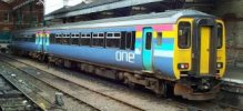
Possibly you prefer contrasting colour schemes than complimentary colour schemes. Blue and orange are opposite each other on a colour wheel, while blue and green sit next to each other. In theory they both work but for different reasons.

Actually come to think of it, I think you're right. I've never thought about it before.

I loved the old SPT and GMPTE orange and brown/black liveries, quite a contrast there. I also liked BR Blue Grey.

Although maybe there are some complimentary liveries I do like. My favourite livery of all is the old Provincial Sector light blue on the 143s, absolutely gorgeous.
 
Sponsor Post - registered members do not see these adverts; click here to register, or click here to log in
R

RailUK Forums

Taunton

Established Member
Joined
1 Aug 2013
Messages
10,093
Wonder which was the first railway company whose name was not just geographically derived from where they went, an approach that stretched from Stockton & Darlington to British Rail.

Was Virgin the first?
 

Route115?

Member
Joined
26 Jun 2021
Messages
232
Location
Ruislip
I've been beaten by others about FART. Elsewhere in Switzerland I am told that the Montreux Oberland Bernois Railway wanted to rebrand itself as the Goldenpass Line as they though that tourists might associate it with 'The Mob'.
 

387star

On Moderation
Joined
16 Nov 2009
Messages
6,655
I always found their livery options a bit odd too - having started off with the copy cat SWT livery on the 317/6s to the rather bland Purple livery on the 317/3s. Still, it did bring us the original nickname of the Purple People Eater :lol:
Was the original livery PRISM and the later National Express ? That said were the purple and green seats fitted with the first livery ?
 

tbtc

Veteran Member
Joined
16 Dec 2008
Messages
17,882
Location
Reston City Centre
Wonder which was the first railway company whose name was not just geographically derived from where they went, an approach that stretched from Stockton & Darlington to British Rail.

Was Virgin the first?

Interesting question

IIRC Stagecoach ran some sleeper carriages in BR days, if that would count?

'one'

(Image is of a 'one' liveried 156

As I've said before, that livery was ahead of it's time

I've always liked liveries with a "family", so that you can recognise that the different brands belong under the same umbrella (e.g. Stagecoach's three liveries on trains which were red/blue/orange/white but in different proportions depending on the type of train... Lothian's maroon livery is green on East/West Lothian routes and blue on airport routes... even the FirstGroup approach of having three colours split by two diagonals means that they can be "local" whilst following a "national" template) - the "one" name was pretty terrible but the colours were fifteen/twenty years ahead of their time and the concept was a good one
 

Dr Hoo

Established Member
Joined
10 Nov 2015
Messages
3,976
Location
Hope Valley
Wonder which was the first railway company whose name was not just geographically derived from where they went, an approach that stretched from Stockton & Darlington to British Rail.

Was Virgin the first?
The Londonderry Railway predated Avanti by a few years. It was named after the 3rd Marquess of Londonderry but was nowhere near the eponymous settlement in the north of Ireland. It linked Rainton Colliery to Seaham around 1831.

Other lines named after a person included Angerstein's Railway, in Greenwich, in 1851, and Lord Carlisle's Railway at Brampton, in 1776 (possibly the only line in this class built with wooden rails).
 

Taunton

Established Member
Joined
1 Aug 2013
Messages
10,093
The Londonderry Railway predated Avanti by a few years. It was named after the 3rd Marquess of Londonderry but was nowhere near the eponymous settlement in the north of Ireland. It linked Rainton Colliery to Seaham around 1831.
However, I believe it ran over the Marquess of Londonderry's lands (he owned the colliery as well).
The Manchester & Milford Railway

For gross exaggerations about where they might go, the USA is well ahead. The Quanah, Acme and Pacific, a 100-mile short line in Texas linking the first two trivial settlements, stuck the "and Pacific" (some 1,500 miles away) on just to attract investors. In recent times it was merged into the mainstream St Louis San Francisco Railway ("the Frisco"), which just the same never got beyond Texas either.
 

Bletchleyite

Veteran Member
Joined
20 Oct 2014
Messages
97,901
Location
"Marston Vale mafia"
The actual original Stagecoach logo (as seen on the door) must be one of the best branding elements - it's really quite clever, as if you turn it on its side it's two horses on a road, and upright it's a stylised version of the British Isles.

I wonder who designed it?
 

TRAX

Established Member
Joined
2 Dec 2015
Messages
1,647
Location
France
The actual original Stagecoach logo (as seen on the door) must be one of the best branding elements - it's really quite clever, as if you turn it on its side it's two horses on a road, and upright it's a stylised version of the British Isles.

I wonder who designed it?
Horses ? I see dinosaurs :E
 

dorsetdesiro

Member
Joined
30 Oct 2017
Messages
583
I will miss the SWT/EMT swooshes livery, at least it is still visible for now until all fleets eventually receive the SWR & EMR liveries.

The probability of seeing white 444s had been greatly reduced in the past year (60% are now in SWR livery I understand) - dispiriting but inevitable!
 

PTR 444

Established Member
Joined
22 Aug 2019
Messages
2,284
Location
Wimborne
I think the SWT livery would be a good basis for a future GBR brand with variations depending on the type of route. You could have red for Intercity, white for regional express type routes and blue for stopping regional/metro style services.

It would match the colours of the union flag too!
 

mmh

Established Member
Joined
13 Aug 2016
Messages
3,744
The Stagecoach / SWT stripey liveries are basically NSE / "jaffa cake" with corporate logos thrown in. There's nothing original or particularly notable about them, they're just well known due to how many buses in how many parts of the country they ended up on.

See also the later SWT liveries vs SouthWest Airlines, and any branding nerd could tell you about the "concentric circles" era of identikit logos.
 

dorsetdesiro

Member
Joined
30 Oct 2017
Messages
583
I think the SWT livery would be a good basis for a future GBR brand with variations depending on the type of route. You could have red for Intercity, white for regional express type routes and blue for stopping regional/metro style services.

It would match the colours of the union flag too!

That could work if GBR goes for a corporate theme by adopting a single blanket livery for all TOCs/regions, as Stagecoach did for SWT and EMT.
But on the other hand, the English TOC liveries may be retained though with a GBR logo tacked on somewhere.

The Stagecoach / SWT stripey liveries are basically NSE / "jaffa cake" with corporate logos thrown in. There's nothing original or particularly notable about them, they're just well known due to how many buses in how many parts of the country they ended up on.

See also the later SWT liveries vs SouthWest Airlines, and any branding nerd could tell you about the "concentric circles" era of identikit logos.

Ha ha, yes, I do remember the 442s looking odd with the old "SWT" logos tacked on as they didn't receive the old royal blue/orange SWT livery the old slam door units and 455s had at the time - the 442s went straight to the white intercity SWT livery some time later!

The only similarity between SWT and Southwest Air was the blue 450/458 livery as Southwest Air possibly didn't use red & white liveries?
 
Last edited:

Mikey C

Established Member
Joined
11 Feb 2013
Messages
6,854
The Stagecoach / SWT stripey liveries are basically NSE / "jaffa cake" with corporate logos thrown in. There's nothing original or particularly notable about them, they're just well known due to how many buses in how many parts of the country they ended up on.
Only the white version vaguely resembles the NSE livery. To me the red and in particular the blue version look especially smart, and far better than the desperately dull SWR livery.
 

Traveller54

Member
Joined
21 Feb 2015
Messages
113
Location
Renfrewshire
Would have raised a few laughs if Abellio were still using their former name, NedRailways when they took over ScotRail.

Ned is the Scottish equivalent of chav.
 

XAM2175

Established Member
Joined
8 Jun 2016
Messages
3,469
Location
Glasgow
The actual original Stagecoach logo (as seen on the door) must be one of the best branding elements - it's really quite clever, as if you turn it on its side it's two horses on a road, and upright it's a stylised version of the British Isles.
It's the letter H with two Sig runes grafted on to it?? Totally hopeless in my book.
 

Bletchleyite

Veteran Member
Joined
20 Oct 2014
Messages
97,901
Location
"Marston Vale mafia"
It's the letter H with two Sig runes grafted on to it?? Totally hopeless in my book.

The "horses" are also S for Stagecoach - a third meaning. And as you say maybe the road is also an H.

It's very 1980s so would look too dated to use now, but I think it's super-clever. Would love to know who did it. While the livery doesn't beat beachball, it certainly beats the actual beachball symbol which is just a copy of everyone else's.
 

XAM2175

Established Member
Joined
8 Jun 2016
Messages
3,469
Location
Glasgow
The "horses" are also S for Stagecoach - a third meaning. And as you say maybe the road is also an H.
So the company's name - perhaps abbreviated, perhaps not - is SSH? I'm afraid I simply cannot share your enthusiasm for it!
 

MaidaVale

Member
Joined
18 Jun 2021
Messages
117
Location
SW London / Berkshire
WAGN's ridiculous amount of different liveries was rather odd, it's like they could never decide on one. The one pictured below is particularly bad. (photo from 315 preservation society)

Arriva's "Alfie" mascot was rather odd too, not the highest quality of design. There was a cartoon version of him displayed on posters within buses that I can't seem to find an image of, Although it was rather nightmarish iirc. The odd white-background generic mess of a "keep it down" poster is a genuine piece of Arriva marketing material too, taken directly from their own social media. Obviously with the new branding, Alfie was discontinued a few years ago.

bran1.jpgbran2.PNGbran3.png
 

318259

Member
Joined
11 Jun 2011
Messages
176
FirstGroup had what I call "branding Tourettes" at the time... in that any surface that could possibly have their name or logo on it, would have it-

You’re not kidding. “First’s branding of ScotRail” is my answer to this thread.

National Express ran ScotRail until 2004. They didn’t plaster their name on anything – they kept the old ScotRail name and logo, and just changed the colour scheme. The average Joe probably didn’t even realise National Express ran ScotRail.

When First took over, they went crazy. Vinyl (f) logos everywhere. They did them so fast they weren’t even on straight. Repainted all the trains in that horrible Barbie livery. Had all the signs redone with their logo.

I’m pretty sure the Scottish Government’s “permanent ScotRail branding and livery” was their way of telling First to knock it off.
 

rower40

Member
Joined
1 Jan 2008
Messages
332
The logo on the Hitachi Train Care Depot at Ashford "Inspire the Next".

It may mean something in the original Japanese, but it's not come through in translation. Inspire the next ... what? And in UK English, the letter "T" doesn't have an accent on it.
 

Techniquest

Veteran Member
Joined
19 Jun 2005
Messages
21,674
Location
Nowhere Heath
The logo on the Hitachi Train Care Depot at Ashford "Inspire the Next".

It may mean something in the original Japanese, but it's not come through in translation. Inspire the next ... what? And in UK English, the letter "T" doesn't have an accent on it.

I actually think it's a decent slogan. What the 'next' is is down to the individual I would say, but I personally associate the most suitable word with 'generation'. You could also suggest the incomplete sentence could be continued with 'wave of talent' for example.

There are absolutely worse slogans out there, and this one I like. Depending on your viewpoint on Hitachi it's either good or bad I guess! In any case, it makes a fair point that we should inspire whatever follows us to be creative, push the boundaries of ideal thinking and not simply repeat what mistakes we've made etc.
 
Status
Not open for further replies.

Top