• Our booking engine at tickets.railforums.co.uk (powered by TrainSplit) helps support the running of the forum with every ticket purchase! Find out more and ask any questions/give us feedback in this thread!

What makes a good livery?

Status
Not open for further replies.
Sponsor Post - registered members do not see these adverts; click here to register, or click here to log in
R

RailUK Forums

Sorcerer

Member
Joined
20 May 2022
Messages
800
Location
Liverpool
I would like GWR, if the shade of green was just a little bit less dark. It looks like black most of the time, a forest green tone would have been preferable. A stripe or window-band to break up the solid green would help, too.
There is a thin white stripe that runs beneath the windows on the GWR 800/802s. A white window band might've been preferable mind you.

The worst of current liveries though, is Lumo. The solid blue over the whole train without anything other than branding to break it up is just awful. The shade of blue chosen isn't great either- their units just look like plastic toys as a result.
Oddly enough, I feel like on any other operator this would be a fair criticism, but seeing as Lumo's business model is to try and provide cheaper journeys, essentially operating as a single-class "low-cost" operator, I think a cheap livery actually works quite well for their corporate image. For a premier intercity operator it would definitely not match the more expensive fares and style of service, but it's a livery that definitely works for it's niche.
 

jh64

Member
Joined
3 Sep 2015
Messages
100
I think the plain Lumo blue is fine, but there should really be a different colour to follow the lines on the nose end. A light grey to match the doors or black like their TPE and Hull Trains siblings, or my personal favourite in the bottom left here, Orangina edition!
 

Attachments

  • 803s.png
    803s.png
    1.6 MB · Views: 106

Strathclyder

Established Member
Joined
12 Jun 2013
Messages
3,225
Location
Clydebank
First ScotRail.
A small caveat here. Pre-Saltire and during First ScotRail's tenure, all the Strathclyde units just had a white 'F' on the front and bodysides denoting the franchise operator, replacing the National Express 'swoop'. The only ScotRail EMUs to ever get the full First Barbie treatment were the 322s as part of their refurbishment. Saltire reduced that to the 'ScotRail is operated by xxxx' on the doors fleetwide. The only EMU classes (barring the 380s ofc) to be wholly 'Saltire-ised' during First's tenure were the 320s & 334s.

The Strathclyde Carmine & Cream colours as discussed earlier tended to work best on the 303s (4 of which got it), 318s & 320s in my view (attached images copyright of their respective owners):

16742319334_235762be27_o.jpg 569213_orig.jpg UK7103.jpg
 

vuzzeho

Member
Joined
11 Apr 2022
Messages
35
Location
London
I would say that the most important thing in a livery is it being suited and adapted to individual trains' shapes. As said before, Virgin Trains were the best example I can think of, with the difference between their Pendolinos and Voyagers being recognisable but the livery being distinctive. Avanti just seems like they didn't consider the shape of the Pendolino before they applied their livery. I think that with yellow front ends not being required anymore, we have a real opportunity for colour on the network, but it hasn't really been utilised. Obviously colour and distinctiveness are also extremely important - with GWR and GNER doing these well. Govia Thameslink is a little boring but I suppose it works. West Midland Trains is one I wanted to love but I just can't. Those are just my thoughts.
 

Chiltern006

Member
Joined
3 Oct 2018
Messages
658
I have to do a double take whenever I see a photo of a Lumo unit as even in decent quality, perfectly legitimate photos, the livery looks like a bad photoshop job. Particularly at the front.
I feel if they had a black front, they’d be a lot better (shown by my photoshop of my picture attached)

I think the plain Lumo blue is fine, but there should really be a different colour to follow the lines on the nose end. A light grey to match the doors or black like their TPE and Hull Trains siblings, or my personal favourite in the bottom left here, Orangina edition!
beat me to it!
 

Attachments

  • 28BC7F47-26CF-4CBC-BFEB-4E419D650A7F.jpeg
    28BC7F47-26CF-4CBC-BFEB-4E419D650A7F.jpeg
    4.1 MB · Views: 42

tbtc

Veteran Member
Joined
16 Dec 2008
Messages
17,882
Location
Reston City Centre
I would say that the most important thing in a livery is it being suited and adapted to individual trains' shapes. As said before, Virgin Trains were the best example I can think of, with the difference between their Pendolinos and Voyagers being recognisable but the livery being distinctive. Avanti just seems like they didn't consider the shape of the Pendolino before they applied their livery. I think that with yellow front ends not being required anymore, we have a real opportunity for colour on the network, but it hasn't really been utilised. Obviously colour and distinctiveness are also extremely important - with GWR and GNER doing these well. Govia Thameslink is a little boring but I suppose it works. West Midland Trains is one I wanted to love but I just can't. Those are just my thoughts.

Some very good points there (welcome to the Forum btw!)

Too many liveries seem designed "on paper" with no thought for how it'll look on an actual train - one that will operate in both directions, one that will get dirty, one that will have to have different colours of doors to the main body (for accessibility reasons)...

The worst example these days is the new livery on Stagecoach buses, which looks like a pretty enough palate for some things but the complicated swooshes and swoops are broken up by the windows/ doors (and any advertising) - as well as the obvious problem of plain white white skirts after splashing through too many puddles

Whereas the original "Barbie" livery on First buses worked really well - plain dark skirt (hides dirt well and made sure that it was easier to replace damaged panels, given how many bumps/scratches a bus can have - you don't want your vehicles to look like they have had bad luck with accidents or that a replacement panel sticks out like a sort thumb because it's a plain colour rather than having all of the patterns that it should). A splash of pink (thinnish stripe, not overbearing like some wacky/zany colour schemes are with the majority of the vehicle painted in some vivid lime/ orange/ turquoise). The "swoosh" to convey the impression of momentum and to "hide" the rear wheel (rather than a lot of schemes, which seem to be designed by some Ad Agency who forget that their clever patterns will be broken up by awkward necessities like wheels/ windows!). Obviously the "barbie" swoosh wouldn't work so well on a train, given that they operate in both directions, but it was fine on a bus.

Regarding the "vivid" colours - I think that some are needed, but trains look "cheap" if too much is applied. A sober suit/shirt can be broken up by a brighter tie, but you wouldn't wear a suit/ shirt in the same pattern as that tie unless you wanted to look a bit "Colin Hunt from the Fast Show". But a train without any brighter colour can lack visual appeal (e.g. the current ScotRail livery needs more of the lighter blue). A an example, I think that Central Trains would have looked better in deep blue with a splash of bright green, rather than the predominantly bright green livery (with a splash of dark blue) that they opted for.

Rail wise, whilst I found GNER a bit of a Curate's Egg (over-rated by a lot of enthusiasts, despite the fact that they were ignoring "provincial trains and setting up bus links with connecting fares instead), they got the livery very good - simple, fairly upmarket (deep blue and red, understated patriotism?), a splash of colour to stop it looking too dull, easy to replicate on station signs/ staff uniforms etc - I can see why GC went for a "coincidentally" similar approach for their Open Access services on the ECML!

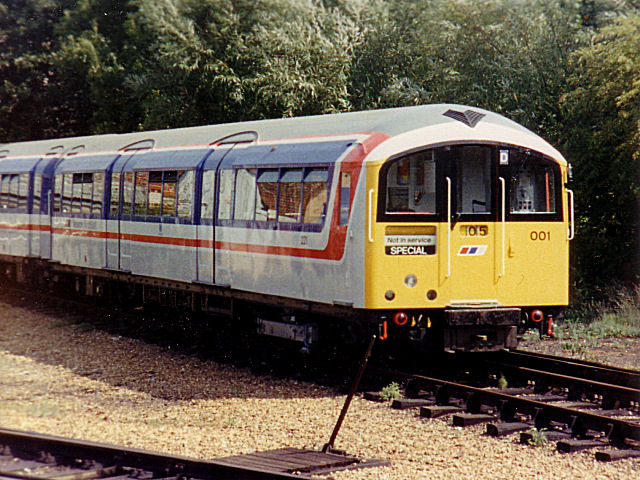
British Rail seemed to understand these things fairly well in later years (I still maintain that BR were much better at branding/ liveries/ presentation than they were at actually running trains) - the dark colours across the windows and the colourful stripe beneath it to denote the "sector" worked well, even if the bottom half of the train looked fairly "beige".

Similarly, BR took the awkward ugly grilles of the HST Power Cars and used them to create the big dynamic "Z" that conveyed the impression that the train was moving at high speeds - that's a great example of dealing with the actual problem of the shape of the train rather than coming up with a snazzy design and then trying to force it onto the actual vehicle as an after thought

The contrasting doors have messed up the simplicity of a number of liveries - I suppose some kudos to London Midland who seemed to design theirs around the doors of a 350 (although it can be a problem when a livery is designed to suit one type of bus/train but then looks terrible on other vehicle shapes) and kudos to Virgin who had the clever idea of black/white doors that stand out enough from the grey bodies to comply with the visibility requirements but also blending in reasonably when seen from a distance so that the aesthetic isn't too messed up

A few liveries were very good without being perfect. I liked the National Express version of ScotRail but there was too much white for me - I think it'd have worked better if the (darker) purple was swapped with the white at the bottom of the trains. I thought that the VTEC idea was pretty good, with the buffet car being highlighted as well as ensuring that the diagonal swoosh was in the right direction for the movement of the train - but the red/white felt a little to "light" - the "original" Virgin colour scheme of red and black might have been better, or at least some darker skirt? VTEC had the relative luxury of being able to implement something on just two types of trains (two similar types), rather than the complication of something like FGW where a stylish swoosh can look good on a dynamically shaped 125mph train but a bit OTT on a boxy 75mph train.

The current trend of white/grey trains with a medium colour (e.g. red) for the doors seems to acknowledge the problem of complying with legislation but really highlights the TOCs with a regular cleaning regime versus the TOCs who don't put their units through a carriage wash very often!

So, in summary:

  • Predominantly dark colours, especially at the window surrounds
  • Horizontal lines work better than vertical/ diagonal
  • A splash of colour but not too much
  • Take windows/doors into consideration at the design stage, rather than finding them an awkward afterthought
  • It's going to get dirty (especially in winters), so design your livery so that it still looks okay without needing repainted every fortnight
 

Worm

Member
Joined
13 May 2020
Messages
90
Location
Manchester
I think you have made a fair summary of the liveries - I do like GWR but anything with GWR on the side of it be 1930s or now would always make me happy! I like how on the back of each seat back there is a small round GWR monogram as well rather than the circular blank disk that appears to fill the same space say on TfW.

You have not mentioned TfW and I think I do think the current TfW livery is better than the old Arriva livery. It is fairly simple. Though I do wonder why TfW didn't go for a more clearly orientated Wales look. Rather than grey / red - green / white / red? or perhaps have a dragon instead of the "T" logo.

Moving on to things local to me providing they don't subsequently add picture graphics to the new Merseyrail 777 units as the 507/8s gained they will look better. The current units look messy, though once looked quite good. I do question the continuing use of yellow though as it leads to confusion say with Manchester Metrolink which is only a few miles down the road, I think it would have been time to go for a unique look. The old Liverpool Corporation green or Birkenhead Corporation blue.
I agree wholeheartedly with your point about TfW’s ‘T’ logo. A Welsh dragon is much more effective image wise, walk into Welsh gift shop and it’s immediate noticeable.

I said this when the rebranding from Arriva occurred but the T logo:

812EBAEE-EF47-42E7-BFDF-AB8F365D58A9.png
Looks too much like the Take That logo:
B4ACED57-7CD1-439E-91A9-1BD3F60F12FE.png
 

fgwrich

Established Member
Joined
15 Apr 2009
Messages
9,290
Location
Between Edinburgh and Exeter
I agree wholeheartedly with your point about TfW’s ‘T’ logo. A Welsh dragon is much more effective image wise, walk into Welsh gift shop and it’s immediate noticeable.

I said this when the rebranding from Arriva occurred but the T logo:

View attachment 115634
Looks too much like the Take That logo:
View attachment 115635
Funny enough, TFWs big T has always reminded me of the St Blazey based Transrail Freight from the 1990s!
 

Attachments

  • DC0AA5B9-1909-48DB-ABE9-BF6D4FE12DE8.jpeg
    DC0AA5B9-1909-48DB-ABE9-BF6D4FE12DE8.jpeg
    39.6 KB · Views: 6

Sorcerer

Member
Joined
20 May 2022
Messages
800
Location
Liverpool
I'm not surprised at similarly designed logos for different railways. I've always noticed Network Rail's logo to bear a mild uncanny resemblance to Amtrak's.
 

AlexNL

Established Member
Joined
19 Dec 2014
Messages
1,683
I don't agree with the sentiment of incorporating dragons into the design of Transport for Wales, especially not in its logo. While Y Ddraig Goch is obviously very important to Wales' identity as a nation and representative of its culture, plastering it all over the transport network could look incredibly tacky.

What I like about the TfW branding is its simplicity, which makes it easy to adapt it to any surface it gets applied to without things looking out of place. Furthermore, elements of the brand can be used to have things stand out on their own while sticking to brand consistency.

For those interested, the TfW branding was developed by Cardiff/Amsterdam based Smörgåsbord Studio. They have an extensive write-up about what has gone into the design of TfW on their website: Smörgåsbord - Transport for Wales Branding.

Smörgåsbord have done more work for Wales in the past, they're the people behind the overall visual identity of Wales. The TfW work builds upon that.
 

Davester50

Member
Joined
22 Feb 2021
Messages
707
Location
UK
BR Blue with Blue/Grey coaches when clean and fresh looked good, much fresher than the steam age and dated Red/Cream and Maroon.
Shame washing plants never seemed to work much!

Mainline, Triple Grey Coal, and Departmental Yellow Grey were probably the best of the post Rail Blue BR liveries.

Post privatisation, original GNER without the red doors is probably the classiest. The SWT white version was also decent. Really disliked the Midland Mainline one.

The modern ribbon effect on the LNER inter-city trains looks good, shame about the daft Azuma branding. ScotRail InterCity looks awful with the blobs on the cars. Would work much better without them.
 

Ashley Hill

Established Member
Joined
8 Dec 2019
Messages
3,264
Location
The West Country
BR Blue with Blue/Grey coaches when clean and fresh looked good, much fresher than the steam age and dated Red/Cream and Maroon.
Shame washing plants never seemed to work much!
The X-mover detergent used at the time whilst getting the filth off,did no favours for the paintwork.
 

Sorcerer

Member
Joined
20 May 2022
Messages
800
Location
Liverpool
The modern ribbon effect on the LNER inter-city trains looks good, shame about the daft Azuma branding. ScotRail InterCity looks awful with the blobs on the cars. Would work much better without them.
I think you're probably in the minority on that because the LNER 800/801 livery is mostly the off-shelf white with nothing but a ribbon to add any element of proper colour to it. It's low effort at best. As for ScotRail, that's more subjective, but those "blobs" (which are outlines of Scottish landmarks) add an element of character that can only apply properly to ScotRail's brand and therefore scores on points of being distinctive as well as making the HST units look more modern.
 

Davester50

Member
Joined
22 Feb 2021
Messages
707
Location
UK
I think you're probably in the minority on that because the LNER 800/801 livery is mostly the off-shelf white with nothing but a ribbon to add any element of proper colour to it. It's low effort at best. As for ScotRail, that's more subjective, but those "blobs" (which are outlines of Scottish landmarks) add an element of character that can only apply properly to ScotRail's brand and therefore scores on points of being distinctive as well as making the HST units look more modern.
I'm aware what the blobs are thanks. There's an explanation in one of the cars what they are.
I wouldn't even say the Dundee and Aberdeen one's are much of the local landmarks.

Dundee used the RRS Discovery as it's landmark for years, and now the V&A building is a symbol of the city. You can even see from their dedicated page that the landmark ScotRail chose for Dundee doesn't feature!
Aberdeen, well Marischal College and the Town House are much more prominant than the Wallace Statue.

The LNER Hitachi sets are reminiscent of the DB ICE trains. If you're going mostly "eurowhite" (to borrow an aviation term), the ribbon scheme works well. It's much better than the awful old Virgin East Coast scheme, which was dated when it was unveiled.
 

Sorcerer

Member
Joined
20 May 2022
Messages
800
Location
Liverpool
The LNER Hitachi sets are reminiscent of the DB ICE trains. If you're going mostly "eurowhite" (to borrow an aviation term), the ribbon scheme works well. It's much better than the awful old Virgin East Coast scheme, which was dated when it was unveiled.
The ICE trains use a red stripe beneath black window bands whereas the LNER livery uses different lines of red as a ribbon that only runs alongside the train. It's not just a single colour ribbon with two/three shades of red, it's literally like a scarf pattern. From a subjective standpoint, there's nothing wrong with liking it, but I would find it very hard to argue that it's anything other than a basic low-effort livery.
 

Davester50

Member
Joined
22 Feb 2021
Messages
707
Location
UK
The ICE trains use a red stripe beneath black window bands whereas the LNER livery uses different lines of red as a ribbon that only runs alongside the train. It's not just a single colour ribbon with two/three shades of red, it's literally like a scarf pattern. From a subjective standpoint, there's nothing wrong with liking it, but I would find it very hard to argue that it's anything other than a basic low-effort livery.
To be pedantic, the ICE uses darkened mirrored ribbon glazing, and you'll not get a more simpler design than one single red stripe.
But it works.
Basic can be as effective as an overly complex design.
 

Goldfish62

Established Member
Joined
14 Feb 2010
Messages
10,045
To be pedantic, the ICE uses darkened mirrored ribbon glazing, and you'll not get a more simpler design than one single red stripe.
But it works.
Basic can be as effective as an overly complex design.
It's a very good livery. As long as it's kept clean and not covered in graffiti, which are both issues.
 

py_megapixel

Established Member
Joined
5 Nov 2018
Messages
6,673
Location
Northern England
Oddly enough, I feel like on any other operator this would be a fair criticism, but seeing as Lumo's business model is to try and provide cheaper journeys, essentially operating as a single-class "low-cost" operator, I think a cheap livery actually works quite well for their corporate image. For a premier intercity operator it would definitely not match the more expensive fares and style of service, but it's a livery that definitely works for it's niche.
Fair point. I wonder if it was actually cheaper for them to have the trains painted into a single base colour rather than something more intricate.
 

43096

On Moderation
Joined
23 Nov 2015
Messages
15,301
It's a very good livery. As long as it's kept clean and not covered in graffiti, which are both issues.
There's been a marked improvement in the graffiti issue with the ICE sets in the last two or three years. It wasn't hard to see the problem: going past the vast Hamburg Eidelstedt/Langenfelde depot it was obvious it wasn't very secure. There was some much more visible security fencing round the site last time I went past.
 

Sorcerer

Member
Joined
20 May 2022
Messages
800
Location
Liverpool
Fair point. I wonder if it was actually cheaper for them to have the trains painted into a single base colour rather than something more intricate.
Possibly. I mean they've got to keep their operations cheap enough to maintain it's low-cost status so that could be a factor.
 

K.o.R

Member
Joined
6 Dec 2017
Messages
658
Since we're talking in pure hypothetical scenarios, I would say the 484s would've been red simply because it's predecessor had the same colour and would be filling a similar role as a local stopper. That is just conjecture on my half though, especially seeing as the 483s didn't seem to have changed colour scheme during it's operation on the Island Line.

483s started off in NSE, then were painted up with dinosaur graphics, before becoming LT red.

483_001_at_St_John%27s_Road%2C_1989_-_geograph.org.uk_-_790855.jpg


1920px-2007_1002_IoW_Train.JPG


1920px-483002_483007_Ryde_Electric_Depot.JPG
 

Sorcerer

Member
Joined
20 May 2022
Messages
800
Location
Liverpool
483s started off in NSE, then were painted up with dinosaur graphics, before becoming LT red.

483_001_at_St_John%27s_Road%2C_1989_-_geograph.org.uk_-_790855.jpg


1920px-2007_1002_IoW_Train.JPG


1920px-483002_483007_Ryde_Electric_Depot.JPG
I actually feel so disgraced right now for not remembering that. Like I knew that was the case, I'd seen them before in that livery. But yet for some reason they slipped from my memory. :(
 

dorsetdesiro

Member
Joined
30 Oct 2017
Messages
583
Ah, the tawdry dinosaur livery - so awful that I try my best not to remember it lol, it was like a misguided attempt to promote the Island Line like a "kiss me quick" Butlins holiday, it was a low for the 483s they deserved better than that.

SWT really should have given them the metro red or regional blue livery at the time.

The LT red livery pretty much did the 483s justice in their remaining time in service as it was their original livery before transferring to the Island Line.
 

mmh

Established Member
Joined
13 Aug 2016
Messages
3,744
I wonder if part of the reason why the yellow smile was removed was to enable an all black roof with no gaps to hide the dirt and grease from tunnels, bridges and overhead lines. One thing you could certainly notice when viewing an old Pendolino from above was that the red roof got very dirty, and it's just as well that this is an area where the passengers generally won't see or it would probably would've been a bigger issue for them. That said, the yellow on the front in it's newest application isn't anywhere near as nice to look at.
Electrostars with their white roofs look bad from above even if the sides are immaculately clean. Quite why you'd have a roof anything other than black is beyond me.
 

jh64

Member
Joined
3 Sep 2015
Messages
100
I think the white colour is to reflect heat from sunlight where a black roof would warm up and stay toasty all day.
 

Sorcerer

Member
Joined
20 May 2022
Messages
800
Location
Liverpool
Electrostars with their white roofs look bad from above even if the sides are immaculately clean. Quite why you'd have a roof anything other than black is beyond me.
I think it's very well documented that white is awful at hiding dirt, so really I can't argue much on black being a superior choice, but I do wonder whether or not other railway conditions play a role such as the age and material used for bridges and tunnels along with the frequency of deep washes.

I think the white colour is to reflect heat from sunlight where a black roof would warm up and stay toasty all day.
I doubt this would be an issue personally. Aside from air conditioning on modern trains keeping the passengers cool (as long as they work properly of course) the air flow would probably help keep the trains themselves cool seeing as the units would usually be moving quite a lot throughout the day and not be exposed to the heat during the night when they aren't being used. I could be wrong and I trust someone more knowledgeable than myself will correct me.
 
Status
Not open for further replies.

Top