• Our booking engine at tickets.railforums.co.uk (powered by TrainSplit) helps support the running of the forum with every ticket purchase! Find out more and ask any questions/give us feedback in this thread!

WMTrains livery and station branding

JaJaWa

Established Member
Joined
14 Feb 2013
Messages
1,705
Location
On a side note, looks like the new TfWM branding is this:

1024px-Transport_for_West_Midlands_Logo.svg.png

Source: https://en.m.wikipedia.org/wiki/Transport_for_West_Midlands
That's a change from the earlier plan which was yellow (presumably why Wolverhampton station was shown that way).

I wonder if the rest of the brands will be orange now too rather than being a different colour like TfL.

Also not sure why the old design only had the WM clearly visible on the Transport for West Midlands logo. IMO this looks much better and should be used across the logos.
 

Attachments

  • Transport for West Midlands.jpeg
    Transport for West Midlands.jpeg
    54.5 KB · Views: 130
Sponsor Post - registered members do not see these adverts; click here to register, or click here to log in
R

RailUK Forums

XCTurbostar

Established Member
Joined
13 Sep 2014
Messages
1,882
Sounds like they want a solid recognisable colour for each area of transport within the West Midlands area. Rail will presumably stay orange.
 

mushroomchow

Member
Joined
14 Feb 2017
Messages
455
Location
Where HSTs Still Scream. Kind of.
So, in a nutshell, WMR are in the process of polishing a turd? Think the horse has bolted already I'm afraid.

Seriously, both the purple / orange and green / yellow liveries rank up there as the worst I've ever seen. And I've now had the displeasure of seeing both "in the flesh" too, so unlike some here I can't pretend they were "alright" once I'd seen them off the drawing board and in service. They've broken the cardinal rule and regressed on the previous designs of London Midland. And, of course, Joe Public is just going to be confused by their attempts to shoehorn two brands into one franchise, let alone with them now tripping over themselves to rebrand said brands.

This is what happens when you let a bunch of design school graduates sit in a boardroom and pay them good money to do something "bold". Ask any passenger sat at a station where both "brands" run, and they'd assume they were two separate companies, with only a shared affinity for appalling livery design to link them to anybody except us anoraks.

The whole muddle is typical of modern franchise design - they've just ended up nullifying any hope of a cohesive brand and in the process melting passengers' eyes when their garish mess of a train turns up.

... can you tell I don't like their liveries? :D
 

Bletchleyite

Veteran Member
Joined
20 Oct 2014
Messages
97,895
Location
"Marston Vale mafia"
There is no yellow in the LNR "Trebor Mints" livery, though I agree it's not particularly good. Unlike @mushroomchow I do however quite like the purple "Cadbury's Double Decker" one. The best livery they have is the LNR/WMT stickers on the old LM livery which actually fit really well.

The two companies thing isn't their fault, the DaFT have required them to do it with a long-term view of full separation. But I can't help but think them using "West Midlands Trains" as the overarching brand was confusing because it's too close to "West Midlands Railway". If it was pure Abellio, I think the concept of "operated by Abellio" would not have confused people in the same way. Perhaps they should have come up with something that sounds more like a brand but also attaches to the Midlands that could be used to name their partnership/limited company - were there not a type of unit branded that way, perhaps "operated by the Meridian Partnership", "operated by Brummie Trains" ( :) ) or somesuch would work reasonably. Even the slightly crass "wmtrains" would have worked better.
 

sprinterguy

Established Member
Joined
4 Mar 2010
Messages
11,065
Location
Macclesfield
I personally think that both liveries are a significant improvement on the bland, featureless predominantly grey schemes that we are increasingly seeing across the board with Govia Thameslink, South Western Railway, West Coast, Greater Anglia, and now Wales & Borders: With the latter two in particular there's little to distinguish between them. I also prefer both the LNR and WMR identities over the conservative, though admittedly professional looking, London Midland livery. It's nice to see someone coming up with an identity that is striking and individual again, in the mould of the original round of privatised operators.

I'm a big fan of area specific liveries to be fair, and I don't recall confusion reigning amongst the public with Regional Railways' myriad PTE influenced liveries during the nineties, even when a PTE branded unit turned up in a different area, which is highly unlikely to be the case this time round.
Apologies if this has already been posted, here is the WMR branding "spirit guide": http://www.westmidlandsrail.com/media/2834/wmr_ci-guidelines_v4_hi-res-2-002-.pdf
Ooh I hadn't seen that before, cheers for that. :)
 
Last edited:

Bletchleyite

Veteran Member
Joined
20 Oct 2014
Messages
97,895
Location
"Marston Vale mafia"
I do happen to find that the whole of the TfWM/WMR/LNWR new corporate identity looks gorgeous and is the best on the network.

Apologies if this has already been posted, here is the WMR branding "spirit guide": http://www.westmidlandsrail.com/media/2834/wmr_ci-guidelines_v4_hi-res-2-002-.pdf

I wouldn't go that far but I do quite like the WMR branding, and am quite a fan of "variant liveries" - i.e. a recognisable shape with differing colours for differing meanings, be that the DB-a-like old SWT variants (white IC, blue regional, red S-bahn, like the old DB pink IC/ICE, blue IR, mint green RB/RE, orange S-bahn) or the old Regional Railways PTE variants.

The LNR branding, however, is rubbish - looks like it should be for a building firm[1] in the 1990s or a packet of Trebor Mints - and the childish posters about bog snorkelling need to go as they are crass in the extreme and do not fit what is quite a professional (and not "fun" unlike VTWC) design.

[1] For some reason it says Norwest Holst to me.
 

whhistle

On Moderation
Joined
30 Dec 2010
Messages
2,636

JordyWM

Member
Joined
4 Nov 2017
Messages
119
Location
West Midlands
New Transport for West Midlands Metro branding now being trialled. They will operate the service from October.

Source: https://twitter.com/andy4wm/status/1003930623755603969

Looks very nice. However there’s no reason why the pink can’t stay. The current NWM Tram logo is blue and pink.

But the new blue branding looks nice.

Seen at Wolverhampton yesterday that the lighting coloumns are now orange and grey, looks much better than the purple/orange at Snow Hill.
 

Harbornite

Established Member
Joined
7 May 2016
Messages
3,634
Somehow it's only just dawned on me that there's a W and an M in the Tfwm symbol!
 

JordyWM

Member
Joined
4 Nov 2017
Messages
119
Location
West Midlands
I do happen to find that the whole of the TfWM/WMR/LNWR new corporate identity looks gorgeous and is the best on the network.

Apologies if this has already been posted, here is the WMR branding "spirit guide": http://www.westmidlandsrail.com/media/2834/wmr_ci-guidelines_v4_hi-res-2-002-.pdf

If I am not mistaken, the new corporate identity was developed by a worldwide company called McCann.

What was they thinking with that concept logo? The two top half diamonds rounded corners with the rest sharp. Hideous.

Even the font they are now using is miles better than what’s in that PDF.
 

jw

Member
Joined
25 Jul 2010
Messages
167
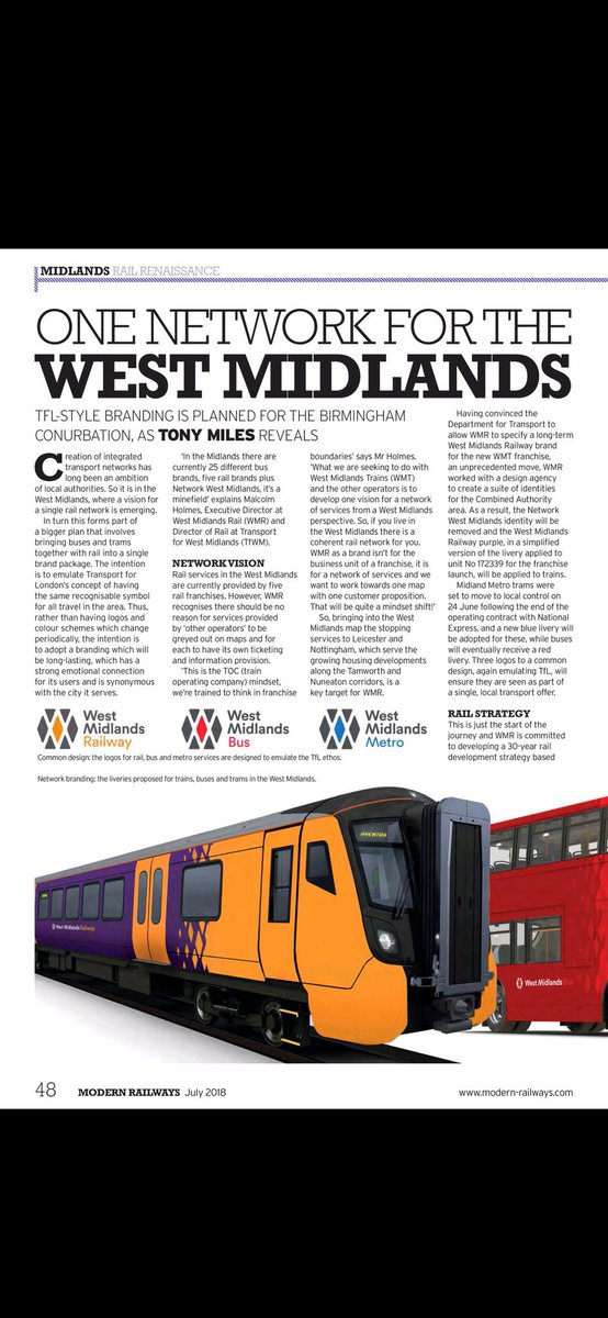
July's edition of Modern Railways carries a feature on West Midlands transport branding.

The proposed branding for West Midlands Railway is shown as a new gangwayed Aventra mock up. This retains the orange and purple, keeping the orange doors, but changes the unit ends to orange, with purple in the middle of the vehicle. No sign of silver, although the image only shows half a vehicle. This is a move away from the current WMR livery on 172339 and that included in the brand guidelines posted previously.

As a brief aside, the blue for the Metro looks much better than the current pink.
 

DenmarkRail

Member
Joined
13 Jun 2016
Messages
665
I do happen to find that the whole of the TfWM/WMR/LNWR new corporate identity looks gorgeous and is the best on the network.

Apologies if this has already been posted, here is the WMR branding "spirit guide": http://www.westmidlandsrail.com/media/2834/wmr_ci-guidelines_v4_hi-res-2-002-.pdf

If I am not mistaken, the new corporate identity was developed by a worldwide company called McCann.

Anyone notice on Page 3, they use a HST to show the new seat fabric designs. Nice
 

Spirit555

Member
Joined
8 Oct 2017
Messages
821
I noticed today a livery variation on 323207. It's driving trailers have had the cab end green at low level replaced by a wrap around grey finish that ends just below the unit number whilst still retaining most of the yellow end.

Is this permanent ? Both cars had it. Unfortunately unable to get a picture.

There is a picture. Not mine.

Link https://www.flickr.com/photos/67444577@N02/28070058417/in/dateposted/

Any further info appreciated.

Update 22/06 - 323205 now the same

Mark
 
Last edited:

JordyWM

Member
Joined
4 Nov 2017
Messages
119
Location
West Midlands
Somehow was lucky (or unlucky) enough to catch both new WMT liveries for the first time yesterday, and one even ended up being a train I was waiting for. Did not look no better in person, and both looked quite dated and too busy.

Although the new mockup looks much better, and it matches in with the new WM Metro livery. Thankfully they have revised nearly everything before the complete rollout.

Still nowhere near as good as the NetworkWM branding, though.

So are the buses going to be losing NX liveries too then?
 

Spirit555

Member
Joined
8 Oct 2017
Messages
821
Somehow was lucky (or unlucky) enough to catch both new WMT liveries for the first time yesterday, and one even ended up being a train I was waiting for. Did not look no better in person, and both looked quite dated and too busy.

Although the new mockup looks much better, and it matches in with the new WM Metro livery. Thankfully they have revised nearly everything before the complete rollout.

Still nowhere near as good as the NetworkWM branding, though.

So are the buses going to be losing NX liveries too then?


NX buses will not loose the livery or brand. They are not associated in any way with TfWM. They are a private company as are all bus companies that operate in the West Midlands. TfWM only sponsor certain services or journeys
 

Harbornite

Established Member
Joined
7 May 2016
Messages
3,634
Orange and purple should be a bad combo but it actually looks decent in that mockup.
 

Top