• Our booking engine at tickets.railforums.co.uk (powered by TrainSplit) helps support the running of the forum with every ticket purchase! Find out more and ask any questions/give us feedback in this thread!

Bad design of Thameslink platform departure screens

BRX

Established Member
Joined
20 Oct 2008
Messages
3,708
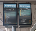
I think the departure screens at Thameslink core stations such as Blackfriars are badly designed and easily cause confusion.

Screenshot 2024-05-21 at 17.49.59.jpg

The left-hand screen shows the 1st (or currently-in-the-platform) train and the right hand screen the subsequent trains.

That might seem logical because we read from left to right, and yes the screens are marked "1st train" and "2nd train".

The problem is that it's very easy for your eye to go first to the screen closest to the train, and read this as referring to the train that's about to arrive or about to depart - especially if you're in a hurry. I do it sometimes (despite being a regular user) and I know other people do it too.

It's exacerbated if you're looking from further away because then it's more likely the left-hand screen is obscured by something in which case the right-hand one becomes the visible one. Below is an example at London Bridge.

Screenshot 2024-05-21 at 17.55.06.jpg

This problem exists on any platform where you are looking in the direction of travel of the trains. Looking in the other direction, it's reversed because then the "1st train" screen is the one closest to the train. This actually makes it harder to train one's brain to look at the right screen automatically.

By the way there's another variation of the problem at platform 2 at Blackfriars because the platform area is shared with platform 3. Here, it's easy to misread the paired screens such that one side relates to platform 2 and the other to platform 3 (whichever direction you're looking in).

Don't think I've noticed this paired-screen arrangement elsewhere on the network.
 
Sponsor Post - registered members do not see these adverts; click here to register, or click here to log in
R

RailUK Forums

hexagon789

Veteran Member
Joined
2 Sep 2016
Messages
15,949
Location
Glasgow
I think the departure screens at Thameslink core stations such as Blackfriars are badly designed and easily cause confusion.

View attachment 158539

The left-hand screen shows the 1st (or currently-in-the-platform) train and the right hand screen the subsequent trains.

That might seem logical because we read from left to right, and yes the screens are marked "1st train" and "2nd train".

The problem is that it's very easy for your eye to go first to the screen closest to the train, and read this as referring to the train that's about to arrive or about to depart - especially if you're in a hurry. I do it sometimes (despite being a regular user) and I know other people do it too.

It's exacerbated if you're looking from further away because then it's more likely the left-hand screen is obscured by something in which case the right-hand one becomes the visible one. Below is an example at London Bridge.

View attachment 158541

This problem exists on any platform where you are looking in the direction of travel of the trains. Looking in the other direction, it's reversed because then the "1st train" screen is the one closest to the train. This actually makes it harder to train one's brain to look at the right screen automatically.

By the way there's another variation of the problem at platform 2 at Blackfriars because the platform area is shared with platform 3. Here, it's easy to misread the paired screens such that one side relates to platform 2 and the other to platform 3 (whichever direction you're looking in).

Don't think I've noticed this paired-screen arrangement elsewhere on the network.
This came up before:


43066

Established Member
Joined
24 Nov 2019
Messages
9,687
Location
London
I think the departure screens at Thameslink core stations such as Blackfriars are badly designed and easily cause confusion.

View attachment 158539

The left-hand screen shows the 1st (or currently-in-the-platform) train and the right hand screen the subsequent trains.

That might seem logical because we read from left to right, and yes the screens are marked "1st train" and "2nd train".

The problem is that it's very easy for your eye to go first to the screen closest to the train, and read this as referring to the train that's about to arrive or about to depart - especially if you're in a hurry. I do it sometimes (despite being a regular user) and I know other people do it too.

It's exacerbated if you're looking from further away because then it's more likely the left-hand screen is obscured by something in which case the right-hand one becomes the visible one. Below is an example at London Bridge.

View attachment 158541

This problem exists on any platform where you are looking in the direction of travel of the trains. Looking in the other direction, it's reversed because then the "1st train" screen is the one closest to the train. This actually makes it harder to train one's brain to look at the right screen automatically.

By the way there's another variation of the problem at platform 2 at Blackfriars because the platform area is shared with platform 3. Here, it's easy to misread the paired screens such that one side relates to platform 2 and the other to platform 3 (whichever direction you're looking in).

Don't think I've noticed this paired-screen arrangement elsewhere on the network.
Agreed. It has caught me out a few times. The arrangement sounds good in theory but just doesn’t work well in practice.
 

BRX

Established Member
Joined
20 Oct 2008
Messages
3,708
This came up before:

Ah!

Not just me then.
 

YorkshireBear

Established Member
Joined
23 Jul 2010
Messages
8,714
Yep I nearly did the same, threw me completely! Why do they have to be different to everyone else!
 

Bigfoot

Member
Joined
2 Dec 2013
Messages
1,151
The word "arrived" does give a significant clue as to what is in the platform. Plus English is read left to right, the left hand screen is logical to me. First train, second train and then subsequent departures. All flows nicely...
 

43066

Established Member
Joined
24 Nov 2019
Messages
9,687
Location
London
Another issue that occurs at St Pancras low level southbound is that the order of the trains sometimes changes right at the last minute. This is usually to reflect a late train being let out of the Canal Tunnels ahead of one coming off the MML, or vice versa, but does mean you can see a train advertised only for one with a different destination to pull into the platform a few seconds later.
 
Last edited:

Magdalia

Established Member
Joined
1 Jan 2022
Messages
3,183
Location
The Fens
Another issue that occurs at St Pancras low level southbound is that the order of the trains sometimes changes right at the last minute.
This also happens with northbound trains at Blackfriars, with trains coming from either London Bridge or Elephant and Castle.
 

b0b

Established Member
Joined
25 Jan 2010
Messages
1,335
The word "arrived" does give a significant clue as to what is in the platform.

Even that doesnt seem so clear. Arrived as in past tense? "At Platform" or "Boarding" would be clearer imho.
 

Bald Rick

Veteran Member
Joined
28 Sep 2010
Messages
29,436
The word "arrived" does give a significant clue as to what is in the platform. Plus English is read left to right, the left hand screen is logical to me. First train, second train and then subsequent departures. All flows nicely...

It’s possible to have two trains showign as ‘Arrived‘ at the same time!
 

Bletchleyite

Veteran Member
Joined
20 Oct 2014
Messages
98,570
Location
"Marston Vale mafia"
I could have sworn they were the other way round at the northbound platform at St Pancras, i.e. with the next train shown nearest the platform edge. Could be wrong though. If I am right it's probably simple to flip them.
 

physics34

Established Member
Joined
1 Dec 2013
Messages
3,734
There are alot of issues regarding signage and displays all over the country. Hence my call for uniformity so there is less confusion. Hopefully Great British Railways can negate the problem.
 

Bald Rick

Veteran Member
Joined
28 Sep 2010
Messages
29,436
As I said in the previous thread. There was a LOT of research into this, by people who are specialists in wayfinding and with psycholgists. They surveyed a great many people including (obviously) passengers. The results were split, but there was a clear preference for reading left to right.

Personally I think they should be swapped, with the first train screen next to the train, and a flipping great arrow on the top of that screen pointing to the train / track saying FIRST TRAIN.
 

Hadders

Veteran Member
Associate Staff
Senior Fares Advisor
Joined
27 Apr 2011
Messages
13,475
I could have sworn they were the other way round at the northbound platform at St Pancras, i.e. with the next train shown nearest the platform edge. Could be wrong though. If I am right it's probably simple to flip them.
If you're standing on the northbound platform facing south then the next train will be on the screen nearest the platform edge. If you're facing northbound then it isn't.

As I said in the previous thread. There was a LOT of research into this, by people who are specialists in wayfinding and with psycholgists. They surveyed a great many people including (obviously) passengers. The results were split, but there was a clear preference for reading left to right.

Personally I think they should be swapped, with the first train screen next to the train, and a flipping great arrow on the top of that screen pointing to the train / track saying FIRST TRAIN.
I agree. It just seems wrong for the first train not to be on the screen nearest to the platform.
 

alistairlees

Established Member
Joined
29 Dec 2016
Messages
3,784
If I was facing the other direction, and looking at the other screens immediately behind those in view, I assume they would have the "1st train" screen next to the train?

In any case, I also agree that these are in a confusing arrangement. Other cues could also be used - such as signage above the monitors, or a green surrounding border to indicate the train now arrived. Unfortunately, there is no consistency between TOCs / stations (if you gon a long journey you have to learn the style at each location) and generally signage at stations is really poor when considered from a typical user / typical situation point of view.
 

BRX

Established Member
Joined
20 Oct 2008
Messages
3,708
As I said in the previous thread. There was a LOT of research into this, by people who are specialists in wayfinding and with psycholgists. They surveyed a great many people including (obviously) passengers. The results were split, but there was a clear preference for reading left to right.

Personally I think they should be swapped, with the first train screen next to the train, and a flipping great arrow on the top of that screen pointing to the train / track saying FIRST TRAIN.
I wonder if the correct response to the results of the survey might have been "actually putting two screens side by side is going to confuse a portion of passengers whichever way round we put them, so let's not put two screens side by side, especially as it has no precedence elsewhere on the network".

At least, don't put two very similar looking screens side by side.

There are alot of issues regarding signage and displays all over the country. Hence my call for uniformity so there is less confusion.
Absolutely.
 

Energy

Established Member
Joined
29 Dec 2018
Messages
4,599
My mockup is a bit crude, but would changing the displays to be like this make it clearer?
1716335843411.png
 

BRX

Established Member
Joined
20 Oct 2008
Messages
3,708
My mockup is a bit crude, but would changing the displays to be like this make it clearer?
View attachment 158553
I don't think so, because "next train" could be misunderstood especially if the left hand screen is not fully in view.

But also, people are used to the idea that a screen with destination plus calling points generally refers to the next departure from a platform. That's where their eyes go first. Whatever the big title at the top says, it's likely that many people won't take it in, because they are focused on the destination of the train. That's what they are used to.
 

AlbertBeale

Established Member
Joined
16 Jun 2019
Messages
2,944
Location
London
I think "first train" rather than "next train" is less ambiguous. It's used in old-fashioned Underground signage I think, in particular when it's not just the train but which platform it's leaving from, when there's an arrow with "next train out" or some such.

Also, it would help if the T/L ones had the next/first/pending train information in a bigger/different style compared to the info about following trains. I think part of the confusion is that the information re the second train also has a column of stopping places set like that for the first train. If the second (and subsequent) services were all shown in the same style as one another (though different from the "first train" one), rather than one being a smaller mimic of the first train info with the rest just being the destination, that would help. Perhaps just a traditional list of the pending services, each having two lines, with the second line a horizontally scrolling list of calling points (since calling points for future trains is useful info). More generally, I find the typeface a bit small on the T/L signs, and the glass screen difficult with reflections sometimes too; I prefer the bolder and clearer (at least for me) yellow electronic signs on lots of Southern stations - except that I would prefer them to have bigger displays so that more space to be given to the first train, so you don't have to wait for the scrolling to see calling points.
 

SussexMan

Member
Joined
23 Oct 2010
Messages
490
I think "first train" rather than "next train" is less ambiguous.

Really? Definitely not the first to depart is it? The "first" train looks to be the second train to me. I can see the first train in the platform, can't I? If that's not the first train, what is it?

Words like "following" or "subsequent" would be more descriptive. But I have concerns what percentage of the population might struggle with what "subsequent" means"
 

Sad Sprinter

Established Member
Joined
5 Jun 2017
Messages
1,900
Location
Way on down South London town
They're not great, too much information for one thing. Although they pale in comparison to the mother of all bad departure boards at Euston. I think Specsavers must be doing a bumper trade since those retina burners were installed
 

Sad Sprinter

Established Member
Joined
5 Jun 2017
Messages
1,900
Location
Way on down South London town
What would you rather they left out?

I'm not sure, something. It is too much and that is becoming more common I think with information screens nowadays. I think I prefer just a horizontal rolling list of stations, rather than a map of ALL the stations listed, or at least as many as the screen can hold, along with carriage letters, err, bike racks, disabled toilets etc etc
 

duffield

Established Member
Joined
31 Jul 2013
Messages
1,403
Location
East Midlands
If I'm heading southbound at St. Pancras (a frequent occurrence) and see there's a train at the platform, I just get on it without checking and then change at Farringdon or Blackfriars if it's the wrong one. :)

Personally I've always liked the departure screens on Thameslink and never found them confusing.
 

Mikey C

Established Member
Joined
11 Feb 2013
Messages
6,920
Maybe the screen for the first train should have a green flash at the top, like they do with those new screens elsewhere which either tell you to go to the platform or wait on the concourse?
 

BRX

Established Member
Joined
20 Oct 2008
Messages
3,708
Part of the problem is that they are mixing up two things that people are used to being separate.
a) The departures board, which shows several of the next trains, and is usually located on the main concourse, and sometimes repeated in a smaller format elsewhere in the station. They might list trains horizontally or vertically, and might give detailed station stops for all of them.
b) Platform indication screens, which are associated with a particular platform, hang near to and are perpendicular to the tracks, and primarily show the next train to depart from that platform. If these have details of subsequent departures they are nearly always listed below the main departure.

Thameslink has done something that no-one is used to, which is a kind of hybrid of the two. If they were to hang the "1st train" screen in its conventional location (projecting over the platform and perpendicular to the tracks), and the "2nd and subsequent departures" screen elsewhere, perhaps close by but towards the back of the platform and parallel with the tracks, then there would be less confusion, and the same info could be displayed.
 

yorkie

Forum Staff
Staff Member
Administrator
Joined
6 Jun 2005
Messages
68,594
Location
Yorkshire
My mockup is a bit crude, but would changing the displays to be like this make it clearer?
View attachment 158553
No (I concur with @BRX above; "Next" could be interpreted as meaning the train currently in the platform, which will be the "next" departure)

A single wider display, with the first train on top, and subsequent trains underneath, might be better.
 

BRX

Established Member
Joined
20 Oct 2008
Messages
3,708
A single wider display, with the first train on top, and subsequent trains underneath, might be better.

I think the designers might have got too attached to the concepts of (1) having the vertical listing of station stops (instead of a more conventional horizontal scrolling one) and (2) listing several subsequent departures in the same location. I can see the potential advantages of both, but I think they then determined everything else, including ending up with the totally non-standard paired screen arrangement, and the end result is a lack of clarity.
 

Top