221101 Voyager
Established Member
This isn't true, there have been subtle changes. As built it was a sort of purplish-red stripe with a lighter red shadow, then this changed to solid red in the late 90s/early 2000s. There have also been subtle font changes. OK, it's not a big change, but Germany tends to do rebrandings very infrequently.
Edit: here's an example of the original livery, though I suspect the old Bundesbahn logo was also applied at some point:

Model of ICE coach in old livery - Hattons
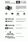
But my point is that DB have had the same basic livery for so long. And although BR did changes, it was still the same basic livery really.BR’s own history says otherwise. Within a period of 10 years, HSTs had three different liveries.
I think the issue is people have run out of ideas and so come up with utter rubbish like Avanti and LNWR.
It seems on here anything new people come up with is snubbed for one reason or another!
Either it's "Oh it looks old fashioned", "Doesn't meet disability regs" and so on!
I think what we need is a simple livery thats a clean design and consists of colours that are easy to keep clean!
Last edited:


")


