-
Our booking engine at tickets.railforums.co.uk (powered by TrainSplit) helps support the running of the forum with every ticket purchase! Find out more and ask any questions/give us feedback in this thread!
You are using an out of date browser. It may not display this or other websites correctly.
You should upgrade or use an alternative browser.
You should upgrade or use an alternative browser.
Stations rebranded to Great British Railways design / Rail Alphabet 2
- Thread starter JaJaWa
- Start date
Sponsor Post - registered members do not see these adverts; click here to register, or click here to log in
R
RailUK Forums
Please tell me these aren’t going to happen. We’re either having a national network or we’re not. The whole design is poor in my opinion in the first place, then if you add short lived TOC logos it just becomes a complete mess. Look at how many times LNER has rebranded over the years, NX, Virgin, East Coast, LNER.Can't help but feel an added logo on the end of the signs makes them look a lot better, plus it allows people to know who operates the station (for the time being before it comes under central control)
Just give the whole network one brand, maybe with different colours for specific purposes like airport colouring for airport stations, but give it one coherent logo. How about errrr the double arrow?
It was a mock-up made by the person who posted it, nothing official.Please tell me these aren’t going to happen. We’re either having a national network or we’re not. The whole design is poor in my opinion in the first place, then if you add short lived TOC logos it just becomes a complete mess. Look at how many times LNER has rebranded over the years, NX, Virgin, East Coast, LNER.
Just give the whole network one brand, maybe with different colours for specific purposes like airport colouring for airport stations, but give it one coherent logo. How about errrr the double arrow?
Class 466
Established Member
- Joined
- 5 Mar 2010
- Messages
- 1,426
So I guess this has all just stopped now? Like pretty much anything else in this country at the moment.
nlogax
Established Member
For sure. There's a definite air of 'given up' about this exercise.
For sure. There's a definite air of 'given up' about this exercise.
I don't understand why it's so difficult.
The Department of Transport have guidelines for road signs that are pretty accurately followed by hundreds of different local authorities throughout the UK. Why can't the same happen with railway signage?
Doctor Fegg
Established Member
- Joined
- 9 Nov 2010
- Messages
- 1,841
Rail Alphabet 2 signage has recently appeared at the bottom of the overbridge on Platform 3 at Oxford station.
It looks out-of-place and, well, a bit spindly compared to the GWR corporate Glypha everywhere else.
It looks out-of-place and, well, a bit spindly compared to the GWR corporate Glypha everywhere else.
jonnyfan
Member
RA2 has been appearing more and more around the Northern network. Most recently I've noticed that Guide Bridge has had all it's signage changed to RA2. A mixture of stickers over existing signs and new signage. As well as the stations along the Hope Valley.
Bletchleyite
Veteran Member
I still dislike the arrows but that does look an improvement.
Yes, thickness of the arrows I think is the problem, along with the rest of the lettering.Arrows are still unnecessarily big (and thin) but borders are an improvement. It's like they're only just starting to speak to any half decent designer about the basics.
Wouldn’t hurt to try an inverse of this too, I believe white on black (or yellow on black) is more legible than scratchy thin black in white
TT-ONR-NRN
Established Member
Did a recent study not prove otherwise? I remember someone saying something like that earlier on in the thread, anyway. Mind you, I think the white on black at Birmingham New Street looks great.Yes, thickness of the arrows I think is the problem, along with the rest of the lettering.
Wouldn’t hurt to try an inverse of this too, I believe white on black (or yellow on black) is more legible than scratchy thin black in white
Where is this?In the updated design manual. Beefed up arrows. Edge framing. Bolder typeface? some obvious user testing and feedback has been happening. Encouraging signs to me.
Phillipimo
Member
Where is this?
Last updated December 2022.
NorthernSpirit
Established Member
- Joined
- 21 Jun 2013
- Messages
- 2,184
Rebranding has been taking place in West Yokshire with Morley being the first to get the new signs, Brighouse has been rebranded for the third time in its 24 year existance with Sowerby Bridge and Mythomroyd gaining the RA2 signage. Huddersfield has limited RA2 stickered all over the station, I think the rest of the Huddersfield Line will be done as and when the Transpennine Route Upgrade sees Mirfield and Ravensthorpe rebuilt and White Rose opening.For sure. There's a definite air of 'given up' about this exercise.
Seems like the main differences between this document and the previous version are that they've added example usage in section 8? Covers materials that should be used and how. Hopefully means the rollout should be more uniform and less do whatever you want.
Ah it's meant to represent Liverpool Street
Last updated December 2022.
jhy44
Member
Much better! Very clear, very smart.View attachment 152104
In the updated design manual. Beefed up arrows. Edge framing. Bolder typeface? some obvious user testing and feedback has been happening. Encouraging signs to me.
Whisky Papa
Member
- Joined
- 8 Aug 2019
- Messages
- 395
I noticed that Todmorden has been re-signed - apologies if it has been mentioned here previously.
To my eye, the large platform number flags have the number aligned slightly nearer the bottom than the top. Has anyone else noticed this elsewhere? EDIT - the manual linked to above shows equal depth margins at top and bottom, page 99.
To my eye, the large platform number flags have the number aligned slightly nearer the bottom than the top. Has anyone else noticed this elsewhere? EDIT - the manual linked to above shows equal depth margins at top and bottom, page 99.
TrainBoy98
Member
Is it just me that thinks a sign for 'Tickets" about 10ft in front of ticket machines that also say "Tickets" is a little unnecessary?RA2 has appeared at clapham junction... but only 2 signs..
View attachment 152848
I'm assuming future planning so they could add something else underneath if/when needed?What's with all the white space?
birchesgreen
Established Member
Its cool these days, check out a modern corporate website.What's with all the white space?
CarrotPie
Member
It's also a waste of sign.Its cool these days, check out a modern corporate website.
birchesgreen
Established Member
Oh yes, i didn't say it was good.It's also a waste of sign.
London Bridge is being done
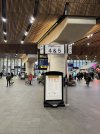
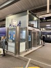


Source: https://x.com/thejrb/status/1760435242526019919Josh B @TheJRB The Rail Alphabet 2-ification of London Bridge has commenced 6:44 AM · Feb 22, 2024 from South East, England·

