However with stations already having partial GBR signage added, the few new stations opening would be good opportunities to do a 'wet run' and do the whole station in the new branding.GBR doesn't exist yet, and isn't likely to until after the next general election. At the moment, it's still the TOCs and/or Network Rail who are doing the station signs.
-
Our booking engine at tickets.railforums.co.uk (powered by TrainSplit) helps support the running of the forum with every ticket purchase! Find out more and ask any questions/give us feedback in this thread!
You are using an out of date browser. It may not display this or other websites correctly.
You should upgrade or use an alternative browser.
You should upgrade or use an alternative browser.
Stations rebranded to Great British Railways design / Rail Alphabet 2
- Thread starter JaJaWa
- Start date
Sponsor Post - registered members do not see these adverts; click here to register, or click here to log in
R
RailUK Forums
Goldfish62
Established Member
- Joined
- 14 Feb 2010
- Messages
- 10,133
If at all. The whole thing could just as likely be shelved.GBR doesn't exist yet, and isn't likely to until after the next general election.
Peter Sarf
Established Member
Trouble is I fear re-branding exercises always seem more attractive than actually changing anything.If at all. The whole thing could just as likely be shelved.
RailWonderer
Established Member
They just need to use this font and swoosh for everything in England. Wales and Scotland can keep what they have but for England, western regions should have a green and yellow swoosh, intercity a red and black, nothern regional a light blue and gray, southern region a green and blue, and eastern region a red and gray. (East Byfleet does not exist, this was taken from Hornby Hobbies).

Joe Paxton
Established Member
- Joined
- 12 Jan 2017
- Messages
- 2,468
Why would Great British Railways use the signage design of South West Trains that was replaced years ago?
Because a rail enthusiast on the internet is a fan of said design...?
TT-ONR-NRN
Established Member
They just need to use this font and swoosh for everything in England. Wales and Scotland can keep what they have but for England, western regions should have a green and yellow swoosh, intercity a red and black, nothern regional a light blue and gray, southern region a green and blue, and eastern region a red and gray. (East Byfleet does not exist, this was taken from Hornby Hobbies).
View attachment 141469


This seems like a shame to me. The WMR font is (I believe) the same as is used at bus stops, bus stations and tram stops across the whole West Midlands. To throw away the only recently established intermodal consistency of signage for TfWM is an interesting choice. I think in the city regions, branding should be consistent with the PTE rather than GBR. I imagine most journeys from University are ‘local’, so it seems more important that the station feels part of Birmingham’s transport network rather than part of the national railway. The WMR/TfWM brand also looks ace in my opinion - it’s the best applied ‘PTE’ brand outside of London. The diamond icon feels like it could become iconic and the brand is smart, a shame to water it down!I’ve noticed the new University station has RA2 signs inside, though interestingly the (new) platform signs still use the WMR font.
I totally agree with you, I think the WMR font would’ve looked much better, oh well!This seems like a shame to me. The WMR font is (I believe) the same as is used at bus stops, bus stations and tram stops across the whole West Midlands. To throw away the only recently established intermodal consistency of signage for TfWM is an interesting choice. I think in the city regions, branding should be consistent with the PTE rather than GBR. I imagine most journeys from University are ‘local’, so it seems more important that the station feels part of Birmingham’s transport network rather than part of the national railway. The WMR/TfWM brand also looks ace in my opinion - it’s the best applied ‘PTE’ brand outside of London. The diamond icon feels like it could become iconic and the brand is smart, a shame to water it down!
SargeNpton
Established Member
- Joined
- 19 Nov 2018
- Messages
- 1,328

As a serious suggestion for signage it couldn't work. It's horribly dated, and whether the government would be able to use the design in the first place is up in the air anyway.Because a rail enthusiast on the internet is a fan of said design...?
Hb06_
Member
I spoke to Avanti West Coast, who manage the station, about this around a year ago out of personal interest. You may also know that when AWC took over the franchise from Virgin Trains, they replaced the old RA1 (British Rail) platform signage with their own design language, to be told off by British Heritage since the station is a listed building, therefore the signs shouldn't have been changed without their say-so. Those station signs (on the old building premises) have therefore been 're-replaced' with RA1. Apparently this was an issue which they were constantly hit with when designing and constructing the new station building.And in Coventry you can find RA1 and RA2 signs within a few feet of each other.
Not sure about the history/reasoning for the directional/wayfinding signage.
nlogax
Established Member
And in Coventry you can find RA1 and RA2 signs within a few feet of each other.
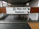
Is it me or is that RA2 example wonky?
Class360/1
Member
Not the only one thinking that. That installation tops the list of awfully applied ra2 signage, and there are lots of examplesIs it me or is that RA2 example wonky?
neontrix
Member
- Joined
- 6 Jan 2017
- Messages
- 34
Wow, they've made a real mess of that. Rail Alphabet 2 used as the type on the signs, but the signs designed in the usual Abellio/Rail UK style. Then a completely different sign design for the platform signs using what looks to be NR Brunel for the type, which isn't the font used by TfWM.I’ve noticed the new University station has RA2 signs inside, though interestingly the (new) platform signs still use the WMR font.
Purple Train
Established Member
At Filey station there are RA1 and RA2 signs right next to each other on the wall of the overall roof on the Scarborough platform.And in Coventry you can find RA1 and RA2 signs within a few feet of each other.
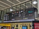
New concourse display at Watford Jct using Rail Alphabet but what seems to be a weight of font inbetween that of RA1 and RA2
Looks very nice and a much better weight than what is used on the signs
nlogax
Established Member
Whatever the weight used here it looks to be a very clean design and well set out for this sort of display. I like it very much.New concourse display at Watford Jct using Rail Alphabet but what seems to be a weight of font inbetween that of RA1 and RA2
Joe Paxton
Established Member
- Joined
- 12 Jan 2017
- Messages
- 2,468
Whatever the weight used here it looks to be a very clean design and well set out for this sort of display. I like it very much.
Shame they didn't take the golden opportunity to splash some sponsorship or advertising on the display to help defray the cost of installation, but of course it can still be done...
[/sarcasm]
gabrielhj07
Member
Looks very nice. Do any WMR branded services stop at Watford though?New concourse display at Watford Jct using Rail Alphabet but what seems to be a weight of font inbetween that of RA1 and RA2
Chiltern006
Member
- Joined
- 3 Oct 2018
- Messages
- 658
Can't help but feel an added logo on the end of the signs makes them look a lot better, plus it allows people to know who operates the station (for the time being before it comes under central control)
Attachments


northwichcat
Veteran Member
Can't help but feel an added logo on the end of the signs makes them look a lot better, plus it allows people to know who operates the station (for the time being before it comes under central control)
I thought they were trying to avoid the cost of rebranding stations every time franchises change hand or routes move between franchises.
It doesn't really matter who operates the station. It matters who operates the train, the ticket office and the TVMs. If the Northern TVM display at Stockport is misleading and a EMR guard on an EMR train informs you to buy a new ticket, then there's not much point complaining to the station operator (Avanti).
43096
On Moderation
- Joined
- 23 Nov 2015
- Messages
- 15,365
No. Do not put superfluous information on signs. Station name boards are there to tell you where you are. Who cleans the toilets/empties the bins/runs the station is irrelevant to an arriving passenger. Signs (should) have a purpose and deliver that. BR got it right with Rail Alphabet in the 1960s. Quite why there is a need to mess around with the basic principles of information provision, I do not know.Can't help but feel an added logo on the end of the signs makes them look a lot better, plus it allows people to know who operates the station (for the time being before it comes under central control)
Can't agree with putting TOC logos on the signs, the main idea of these guidelines are to get away from that and re-establish the double arrow as the symbol of the railways.
I'm really surprised we haven't seen a full Network Rail station re-signed in these guidelines yet, Birmingham kinda has been but done in a non-standard way. The guidelines are now almost 3 years old and at least one London station was meant to have got it done by now. So far it's only been rolled out in patchworks as signs have needed replacing, and even then half the time they've continued to put up the old designs.
I'm really surprised we haven't seen a full Network Rail station re-signed in these guidelines yet, Birmingham kinda has been but done in a non-standard way. The guidelines are now almost 3 years old and at least one London station was meant to have got it done by now. So far it's only been rolled out in patchworks as signs have needed replacing, and even then half the time they've continued to put up the old designs.
Can't agree with putting TOC logos on the signs, the main idea of these guidelines are to get away from that and re-establish the double arrow as the symbol of the railways.
I'm really surprised we haven't seen a full Network Rail station re-signed in these guidelines yet, Birmingham kinda has been but done in a non-standard way. The guidelines are now almost 3 years old and at least one London station was meant to have got it done by now. So far it's only been rolled out in patchworks as signs have needed replacing, and even then half the time they've continued to put up the old designs.
As a retired architect I believe looks are important- but what info it conveys is more important. And unnecessary cost. And less is more.I thought they were trying to avoid the cost of rebranding stations every time franchises change hand or routes move between franchises.
It doesn't really matter who operates the station. It matters who operates the train, the ticket office and the TVMs. If the Northern TVM display at Stockport is misleading and a EMR guard on an EMR train informs you to buy a new ticket, then there's not much point complaining to the station operator (Avanti).
Looks like somewhere between 'jobs for the boys', 'makework schemes', and 'jam tomorrow'. How much (little) of Great British Railways do/should we expect to see or hear between now and the General Election?
Happy New Year.
TheLunaPark
Member
As others have said, the RA2 signs rollout has been a shambles, predictably. Personally, I didn't think the guideline designs were particularly strong in the first place but ultimately, they should have been followed and implemented properly. Instead, we've already ended up with a mess of DIY signs and incorrect designs. Can't say I expected any better. One small team of people should have been assigned ONLY to this rollout. They should have handled everything from initial design to the manufacturing to the actual rollout on-site, travelling to each station and carrying out the work properly. Not one single station has got it completely right. Of course, the different layouts and styles of architecture for stations around the country mean a lot of care is needed, which is precisely why the job should have been given to one small team that knew what it was doing.
ScottGallagher
Member
- Joined
- 9 Dec 2012
- Messages
- 605
Aside from the signage, will there be a standard paint colour used for benches, lamp posts, doors etc, that can be just as operator specific as the current signage. Avanti are still painting everything teal. If the ultimate goal is uniformity theres no point in specifying one without the other.