birchesgreen
Established Member
These don't look too bad, is there any white on black? I think those look pretty good at New St.
These look quite good. Less of that white space.London Bridge is being done
View attachment 152954View attachment 152955
Source: https://x.com/thejrb/status/1760435242526019919
London Bridge is being done
View attachment 152954View attachment 152955
Source: https://x.com/thejrb/status/1760435242526019919
Hahahaha. I always struggle there, whoever designed the layout of the ticket barriers a) had never used a train before and b) was blind.
Does the 'DOWN' sign in the second photograph refer to the lift? In which case, why is the arrow not pointing diagonally towards the door? And why is it in upper-case when all other signs are in lower-case? And if it doesn't refer to the lift it is extremely confusing.London Bridge is being done
View attachment 152954View attachment 152955
Source: https://x.com/thejrb/status/1760435242526019919
The down sign refers to line directions (i.e. away from London). It's for the benefit of dispatch staff. There's a light to show the CD/RA status below it too.Does the 'DOWN' sign in the second photograph refer to the lift? In which case, why is the arrow not pointing diagonally towards the door? And why is it in upper-case when all other signs are in lower-case? And if it doesn't refer to the lift it is extremely confusing.
At a guess: that looks like it's for staff reference, given its proximity to a signal indicator. "Down" likely refers to the Down direction of the line.Does the 'DOWN' sign in the second photograph refer to the lift? In which case, why is the arrow not pointing diagonally towards the door? And why is it in upper-case when all other signs are in lower-case? And if it doesn't refer to the lift it is extremely confusing.
This must be one of the naffest implementations yet - the Platforms 4&5 sign is terrible. Random amounts of whitespace around the edges, that makes it looks different from all the others. Random font sizes where neither match the size of the arrows. Why are the arrows on separate signs? Why is there a black border around each individual section of the sign? What happened to the double arrow going next to platform direction signs? Also, do we really need four signs saying Lift next to each other?London Bridge is being done
View attachment 152954View attachment 152955
Source: https://x.com/thejrb/status/1760435242526019919
There was a study that 'proved' black on white showed up more, but I think their methodology was very flawed. They effectively created an average background - which is clearly going to be a greyish blur and make white stand out. But backgrounds aren't greyish blurs - there is loads of white about, and lots of black on white signs and adverts.Did a recent study not prove otherwise? I remember someone saying something like that earlier on in the thread, anyway. Mind you, I think the white on black at Birmingham New Street looks great.
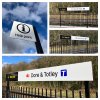
Please tell me these aren’t going to happen. We’re either having a national network or we’re not. The whole design is poor in my opinion in the first place, then if you add short lived TOC logos it just becomes a complete mess. Look at how many times LNER has rebranded over the years, NX, Virgin, East Coast, LNER.
Just give the whole network one brand, maybe with different colours for specific purposes like airport colouring for airport stations, but give it one coherent logo. How about errrr the double arrow?
That's awful. There is too much white space. And who understands that intrusive T logo? I don't. It looks more like a dead-end sign.Double (G)BR / Travel South Yorkshire branding at Dore & Totley
View attachment 153418
Source: https://www.linkedin.com/posts/tran...ionindustry-activity-7168304733286289408-Trj3
Double (G)BR / Travel South Yorkshire branding at Dore & Totley
View attachment 153418
Source: https://www.linkedin.com/posts/tran...ionindustry-activity-7168304733286289408-Trj3
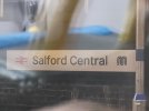
To me, the lettering looks too small.Double (G)BR / Travel South Yorkshire branding at Dore & Totley
View attachment 153418
Source: https://www.linkedin.com/posts/tran...ionindustry-activity-7168304733286289408-Trj3
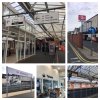
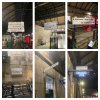
This is British Rail RA1, not the new RA2. Arguably superior though.Cannot remember if we've mentioned Bath, but here it is.View attachment 153554
This is British Rail RA1, not the new RA2. Arguably superior though.
Why have they decided that every single platform at Hull and Morley needs a (G)BR logo? It's a train station, of course the platform will have trains! I'd love to know who signed off on thatAnd some horrors at Hull and Morley which appear to be based on an imagination of the standards document rather than the actual thing
View attachment 153541
Source: https://www.linkedin.com/posts/tran...ranspennine-activity-7138825901118480384-9-pZ
Maybe it’s because their new format is so bland that they need to make it clear which signs are railway ones.Why have they decided that every single platform at Hull and Morley needs a (G)BR logo? It's a train station, of course the platform will have trains! I'd love to know who signed off on that
Maybe it’s because their new format is so bland that they need to make it clear which signs are railway ones.
This one looks quite nice to be honest. White on black looks far better than black on white.RA2 starting to crop up at Victoria now
