Just for a laugh, could anyone edit the yellow front off a pacer (class 144)?
Might be interesting.

Bit of a rushed job, but good enough for getting the gist
Just for a laugh, could anyone edit the yellow front off a pacer (class 144)?
Might be interesting.
I love the pinky red line on the roof but can someone substitute the yellow on the front and part of the roofline for the same colour red as the silk on the train where the virgin logo is please? Sorry I know it’s an old picture but anyone can photoshop it who knows howI think the new Virgin Trains livery used on the West Coast Main Line could use a few changes. The final product looks something like a Swiss livery.
View attachment 39768
I'll admit, I think that's the smartest the 144s have looked for a long time.
Bit of a rushed job, but good enough for getting the gist")
Looks surprisingly good.
Bit of a rushed job, but good enough for getting the gist
The lavender line needs extending to the cabs but apart from that, I approve.How about, for Thameslink, the same basic livery, just with some colours swapped with each other?
I appreciate that this may be stretching the definition of "slight change"
View attachment 73667
Credit to 'WestRail642fan' on Wikipedia for the original livery diagram.
First Kernow uses GWR green for its Truronian coach fleet. Interestingly, recent repaints have been in a lighter green and it looks much smarter.I think that the present GWR livery could be much improved by keeping the same design but with a lighter/brighter shade of green.
In bright weather the present livery looks attractive IMHO, but in dull weather or under electric light it looks very dull.
Not a very bright or dayglow green, but a bit brighter than used at present.
Any expert on here fancy doing a photoshopped brighter green GWR livery, perhaps next to a unit in the real livery ?
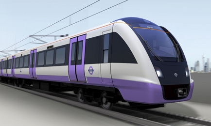
On the Class 345s I would get rid of all the angled nonsense and use a narrower purple band that doesn't extend all the way to the window, to match the usual TfL style. The current livery seems overengineered and doesn't match with the Underground, Overground, Trams etc.
A bit like this early 345 concept:
Wasn't it designed to deter graffiti? Blue & red must've been the most prevalent colours used.Interestingly, I believe the design (the original "red doors, blue skirt" on LU) was by a member of LU staff who just came up with it, not a professional designer.
Yes. Several versions were mocked up. Line coloured fronts and doors, blue window line, blue doors, etc. Eventually the current version was settled at as looking the cleanest and freshest. Despite being 30 years old I think it's stood the test of time remarkably well.I like that. TfL had a very well designed livery concept, all it needed was to change the door and skirting stripe colour to the one representing that mode of transport.
Interestingly, I believe the design (the original "red doors, blue skirt" on LU) was by a member of LU staff who just came up with it, not a professional designer.
If they'd had line-coloured doors, what on earth would that have done with the S7 stock?Yes. Several versions were mocked up. Line coloured fronts and doors, blue window line, blue doors, etc. Eventually the current version was settled at as looking the cleanest and freshest. Despite being 30 years old I think it's stood the test of time remarkably well.
That was in the late 80s. The S stock wasn't even a twinkle in a designer's eye back then.If they'd had line-coloured doors, what on earth would that have done with the S7 stock?
Ultimately I like what they have now. It's basic, but it means that it doesn't look outdated at all in the modern day.


Not true that they both vinyl wraps. The non-striped version is painted.I'll just throw out another suggestion: can we have the stripes back on SWR please?
I far preferred the livery with them, and since they are all just vinyl wraps now anyway, surely there can't be a massive cost difference between the two?
Current SWR livery revision, with credit to Adam Bryant
Nicer (IMO) striped version, with credit to 'Feathers44' on Wikimedia:
Oh, OK, my mistake. I must have misunderstood another post then.Not true that they both vinyl wraps. The non-striped version is painted.
I'll just throw out another suggestion: can we have the stripes back on SWR please?
I far preferred the livery with them, and since they are all just vinyl wraps now anyway, surely there can't be a massive cost difference between the two?
Current SWR livery revision, with credit to Adam Bryant
Nicer (IMO) striped version, with credit to 'Feathers44' on Wikimedia:
I emailed them and the majority of the dirt is caused by a lubricant and will be sorted out shortly.is this what you are after?
No problem.Oh, OK, my mistake. I must have misunderstood another post then.
As the aluminium on the stock aged it pitted and when graffiti was removed it left an unsightly shadow. For this reason it was decided to revert to painting stock.Wasn't it designed to deter graffiti? Blue & red must've been the most prevalent colours used.
I think I'd make the whole train dark (maybe stripey) blue. The ends look so nice in my opinion, almost seems disappointing for it to switch to grey after.In my opinion the the stripey one looks too 'busy'. Only change id make to SWT livery is a dark roof.
On the Class 345s I would get rid of all the angled nonsense and use a narrower purple band that doesn't extend all the way to the window, to match the usual TfL style. The current livery seems overengineered and doesn't match with the Underground, Overground, Trams etc.
A bit like this early 345 concept:
The SWR grey is in fact a very, very dark blue-grey. In certain lights it does show as blue.I think I'd make the whole train dark (maybe stripey) blue. The ends look so nice in my opinion, almost seems disappointing for it to switch to grey after.
Considering how good the london overground livery looks on the 710s, I wish they'd just done a purple version of that - none of the silly angles but with strikingly modern gloss black.
At least we'd actually be able to see tube trains then. I've only ever seen engineering trains on the underground.All the TfL liveries should be harmonised to the blue and white, plus an accent line, doors and front in the sector colour. And of course a yellow section on said fronts
Looks surprisingly cleanLooks surprisingly good.
The angry bird with a different beak - all over red, black or white.
