It says "Adult Standard Class with" then there is some overprinted text and the letter C.Most of us check by the listed railcard, for me the D either goes unnoticed or after I've noted the listed railcard.
-
Our booking engine at tickets.railforums.co.uk (powered by TrainSplit) helps support the running of the forum with every ticket purchase! Find out more and ask any questions/give us feedback in this thread!
You are using an out of date browser. It may not display this or other websites correctly.
You should upgrade or use an alternative browser.
You should upgrade or use an alternative browser.
New Ticket Design Launched
- Thread starter Solent&Wessex
- Start date
- Status
- Not open for further replies.
Sponsor Post - registered members do not see these adverts; click here to register, or click here to log in
R
RailUK Forums
bb21
Emeritus Moderator
- Joined
- 4 Feb 2010
- Messages
- 24,151
Can I just say that I think the new design is terrible. It looks like it was designed on the back of a fag packet. And the worst thing is they don't even print out properly! You get words printed on top of other words! :roll:
I can't see what was wrong with the old design. Time for ATOC to have a re-think I think.
As with many ticketing-related projects in the industry, the initial idea was sound, but the test run was incomplete and the implementation hugely variable, putting it politely.
The quality of some of the tickets are a far cry from the initial trial phase, and have to be seen to be believed, but of course no one foresaw that coming, given the huge variations in font styles and print quality already in existence. :roll:
Paul Kelly
Verified Rep - BR Fares
Is there a consensus on what the initial idea actually was? There was a lot of murmuring at the start about getting rid of "jargon", but new format tickets to London still show "London Terminals", and instead of "Route: ANY PERMITTED" now we generally have "Travel is allowed via any permitted route" - yes, a small improvement in clarity, but it's not much! And some information useful for ticket checking/inspections has been removed, such as the distinction between different types of discounts as mentioned above. I have seen some of the sample/specimen examples of the new print formats that are provided to ticket machine suppliers as a reference, and even some of them have problems with overlapping print and generally untidy (to my eyes anyway) formatting.As with many ticketing-related projects in the industry, the initial idea was sound
bb21
Emeritus Moderator
- Joined
- 4 Feb 2010
- Messages
- 24,151
Is there a consensus on what the initial idea actually was? There was a lot of murmuring at the start about getting rid of "jargon", but new format tickets to London still show "London Terminals", and instead of "Route: ANY PERMITTED" now we generally have "Travel is allowed via any permitted route" - yes, a small improvement in clarity, but it's not much! And some information useful for ticket checking/inspections has been removed, such as the distinction between different types of discounts as mentioned above. I have seen some of the sample/specimen examples of the new print formats that are provided to ticket machine suppliers as a reference, and even some of them have problems with overlapping print and generally untidy (to my eyes anyway) formatting.
I heard a lot of rumours about the need to get rid of the "multiple reservation coupons" issue which apparently DfT had taken an interest in, and that became the starting point of the latest project.
How true it is, I have no idea but there were a lot of rumours on and off the forum.
Not that the end product is that good, in any case, mind.
applepie2100
Member
- Joined
- 16 Aug 2011
- Messages
- 167
The clearest and best version of the new ticket I've seen thus far comes from ScotRail and the new StarMobile machines. I've no idea what printer they're using but it's still fanfold tickets and the print is pin sharp and very readable, even with my poor eyesight.
Although I suppose with the printers being brand new you'd expect that!
Although I suppose with the printers being brand new you'd expect that!
Wallsendmag
Established Member
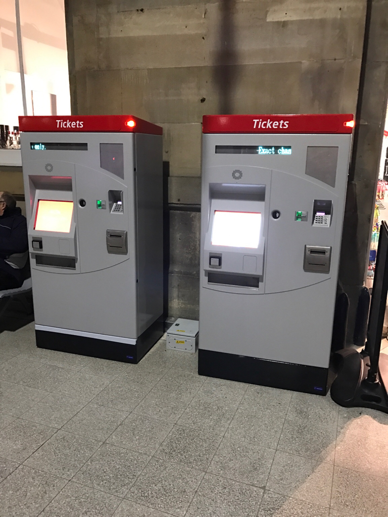
There are some nice crisply printed tickets being issued by the two new Parkeon TVMs in Newcastle
There are some nice crisply printed tickets being issued by the two new Parkeon TVMs in Newcastle
Are these Parkeon TVMs run by Virgin Trains East Coast? Are they their first?
Haywain
Veteran Member
- Joined
- 3 Feb 2013
- Messages
- 15,266
The first of many, I've heard.
Sent from my SM-G800F using Tapatalk
Sent from my SM-G800F using Tapatalk
There are some nice crisply printed tickets being issued by the two new Parkeon TVMs in Newcastle
Must be like the ones installed by SWT a few months ago (my example in Post 846)
BluePenguin
On Moderation
I HATE this new ticket design! Everything is aligned to the left and does not make the most of the room on the ticket. The right side is almost plank
--- old post above --- --- new post below ---
My friend visited me the other day. He got off at Ramsgate where Revenue Inspectors were checking tickets. He showed them his perfectly valid ticket to Ramsgate which was printed in this new design and they insisted that it was fake. They then proceeded to take down his details and they were about to issue him with a fine....
....until someone else who had gotten off another train came along with the same design!
My friend suffers from anxiety and almost had a panic attack from the whole ordeal but Southeastern were far from sympathetic or understanding and just blamed National Rail without even giving an apology.
Why fix something that is not broken? There should be more money invested into educating people on how to read tickets, not wasting money on "simplifying" the layout that has been the used for years.
Dumbing down ticket designs is not going to help anyone. People will still continue to get on the wrong train in the peak. Other will still try to travel on later trains with advance ticket and nothing will stop people from sharing their rail card with their friends to save them a few quid. Not forgetting those who pretend they forgot their rail card or those who don't bother buying a ticket at all.
And now it seems half of the Revenue Protection staff are have not been given updated training with regards to the new ticket layout!!
Last edited:
Why fix something that is not broken? There should be more money invested into educating people on how to read tickets, not wasting money on "simplifying" the layout that has been the used for years.
Dumbing down ticket designs is not going to help anyone. People will still continue to get on the wrong train in the peak. Other will still try to travel on later trains with advance ticket and nothing will stop people from sharing their rail card with their friends to save them a few quid.
A very astute post, if I may say.
BluePenguin
On Moderation
A very astute post, if I may say.
Thank you. I wish that Southeastern and National Rail would agree with you!
Thank you. I wish that Southeastern and National Rail would agree with you!
So do I
Wallsendmag
Established Member
It's hardly new is it ,how many years has it been out now
Sent from my iPad using Tapatalk Pro
Sent from my iPad using Tapatalk Pro
Solent&Wessex
Established Member
- Joined
- 9 Jul 2009
- Messages
- 2,685
My friend visited me the other day. He got off at Ramsgate where Revenue Inspectors were checking tickets. He showed them his perfectly valid ticket to Ramsgate which was printed in this new design and they insisted that it was fake.
The problem is that there are now must be literally hundreds of different versions of the new design. Every machine seems to print them differently, and for added complication some of them that print the "new style" keep changing to a different style of new style. Season tickets have started appearing from some TIS but they are in a different format to the last version of season tickets which emerged in a new design.
How on earth they expect anyone to be able to tell what is real or not I really don't know.
Wallsendmag
Established Member
Sent from my iPad using Tapatalk Pro
It's silly really. This is exactly the sort of thing that ATOC/RDG should be taking the lead on by establishing one standard with clear and strict quality requirements which they then give to the various TOCs and TVM/TIS manufactures to implement. If they can't meet the standard then they don't get to print the new style!
Then again I think that the same thing should have happened for Avantix replacement...
Then again I think that the same thing should have happened for Avantix replacement...
causton
Established Member
I have bought two tickets using the Virgin Red App discount now, printed on two separate machines, both had 'D' printed in the top corner. One printed on an S&B and one on a Shere machine. I'm not quite sure the purpose of printing this, given the fact the ticket is discounted is of no relevance to the person checking tickets, nor the customer.
I had this, a discounted online advanced was issued "Adult with DISCOUNT AUTHORITY" which sounds very ominous. Nobody I ask that I work with knew the D meant discounted anyway!
It's silly really. This is exactly the sort of thing that ATOC/RDG should be taking the lead on by establishing one standard with clear and strict quality requirements which they then give to the various TOCs and TVM/TIS manufactures to implement. If they can't meet the standard then they don't get to print the new style!
Tickets should look the same, whatever the printer/machine. Ticket vending machine user interfaces should also be the same nationally, with the only thing different being branding - although is even that necessary? Why not National Rail branding, with everything managed by ATOC/RTG?
You can be 100% sure that if you set tight rules on how machines must operate and print, all companies wanting to sell their hardware would comply. It really wouldn't be a problem, and far better than each company coming up with its own software for TOCs to rebrand, with different layouts and capabilities.
Customers get confused buying tickets. Staff get confused checking tickets. What a farce!
Last edited:
roversfan2001
Established Member
I bought an Advance using a 20% off code and it says "Under 16 year old 1st Class with DISCOUNT AUTHORITY" on it; I'm expecting it not to go smoothly, that's for sure.I had this, a discounted online advanced was issued "Adult with DISCOUNT AUTHORITY" which sounds very ominous. Nobody I ask that I work with knew the D meant discounted anyway!
Sent from my HTC Desire 530 using Tapatalk
Image
Thank you
Tickets should look the same, whatever the printer/machine. Ticket vending machine user interfaces should also be the same nationally, with the only thing different being branding - although is even that necessary? Why not National Rail branding, with everything managed by ATOC/RTG?
You can be 100% sure that if you set tight rules on how machines must operate and print, all companies wanting to sell their hardware would comply. It really wouldn't be a problem, and far better than each company coming up with its own software for TOCs to rebrand, with different layouts and capabilities.
Customers get confused buying tickets. Staff get confused checking tickets. What a farce!
Exactly! How is it this hard to manage that?!
causton
Established Member
Tickets should look the same, whatever the printer/machine. Ticket vending machine user interfaces should also be the same nationally, with the only thing different being branding - although is even that necessary? Why not National Rail branding, with everything managed by ATOC/RTG?
You can be 100% sure that if you set tight rules on how machines must operate and print, all companies wanting to sell their hardware would comply. It really wouldn't be a problem, and far better than each company coming up with its own software for TOCs to rebrand, with different layouts and capabilities.
Customers get confused buying tickets. Staff get confused checking tickets. What a farce!
This I can agree with 100%. Perhaps the colours can be changed, but not even the operators can be trusted not to **** that up, as there is a TVM at Doleham with Thameslink & Great Northern software and logos on...

Source: https://www.youtube.com/watch?v=uGb9P-1J9Rk
Wallsendmag
Established Member
It's silly really. This is exactly the sort of thing that ATOC/RDG should be taking the lead on by establishing one standard with clear and strict quality requirements which they then give to the various TOCs and TVM/TIS manufactures to implement. If they can't meet the standard then they don't get to print the new style!
Then again I think that the same thing should have happened for Avantix replacement...
They do , the problem comes with legacy systems that can't print in the new format quite as well as people would like
Sent from my iPad using Tapatalk Pro
Legacy systems can be replaced quicker than it has taken (is taking) to do this.They do , the problem comes with legacy systems that can't print in the new format quite as well as people would like
Sent from my iPad using Tapatalk Pro
Govia seems to be ditching Shere machines so surely other old machines, which likely have ancient hardware that brings other problems of their own (like taking 10-15 minutes to boot up!), can be replaced to solve the problem?
I know that costs money but ticket machines must be replaced, or upgraded, at some point? So an old printer isn't just kept forever.
Wallsendmag
Established Member
I believe VTEC are following their lead new machines in Edinburgh Durham and York as well by all accounts
Sent from my iPad using Tapatalk Pro
Sent from my iPad using Tapatalk Pro
It's hardly new is it ,how many years has it been out now
Sent from my iPad using Tapatalk Pro
And has there been any publicity for passengers who suddenly find their tickets are different when they use a different station or machine? I've seen people think their ticket hasn't printed and they've just got the receipt.
BurtonM
Member
It's silly really. This is exactly the sort of thing that ATOC/RDG should be taking the lead on by establishing one standard with clear and strict quality requirements which they then give to the various TOCs and TVM/TIS manufactures to implement. If they can't meet the standard then they don't get to print the new style!
What, like we already had?
What, like we already had?
I think a new ticket design was/is a good idea, but from the outset there should have been a clear definition of what that was going to be. Then there would be a plan to implement over a fair period, whether one year, two years or even five years.
There aren't that many makes of TVM or printers, and any modern printer can print whatever you want - it's just an image.
I can't understand how this has gone so terribly wrong. Who managed the whole project? Who kept each TOC in line? Who made sure the online booking systems would send the right data to machines?
And more importantly, of all these competing designs, who spoke to those who have to check the tickets who will see loads of different types, and have seen changes to the way discounts are marked, or overlapping text that made it impossible to see what railcard was used etc.
Even how the tickets are printed to aid the vision impaired? Lots of small text, yet often lots of blank space.
- Status
- Not open for further replies.